Recipe app · Responsive web · End-to-end UX/UI · 8 weeks
Dishcovery — Recipe App
Overview
People cook all the time, but avoid recipe apps. That gap felt worth understanding.
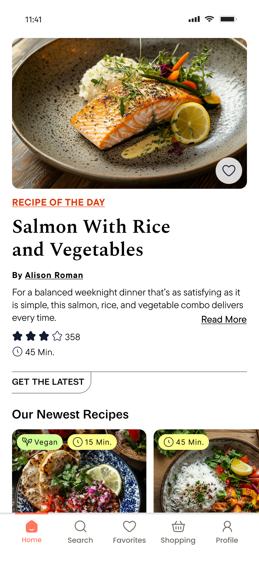
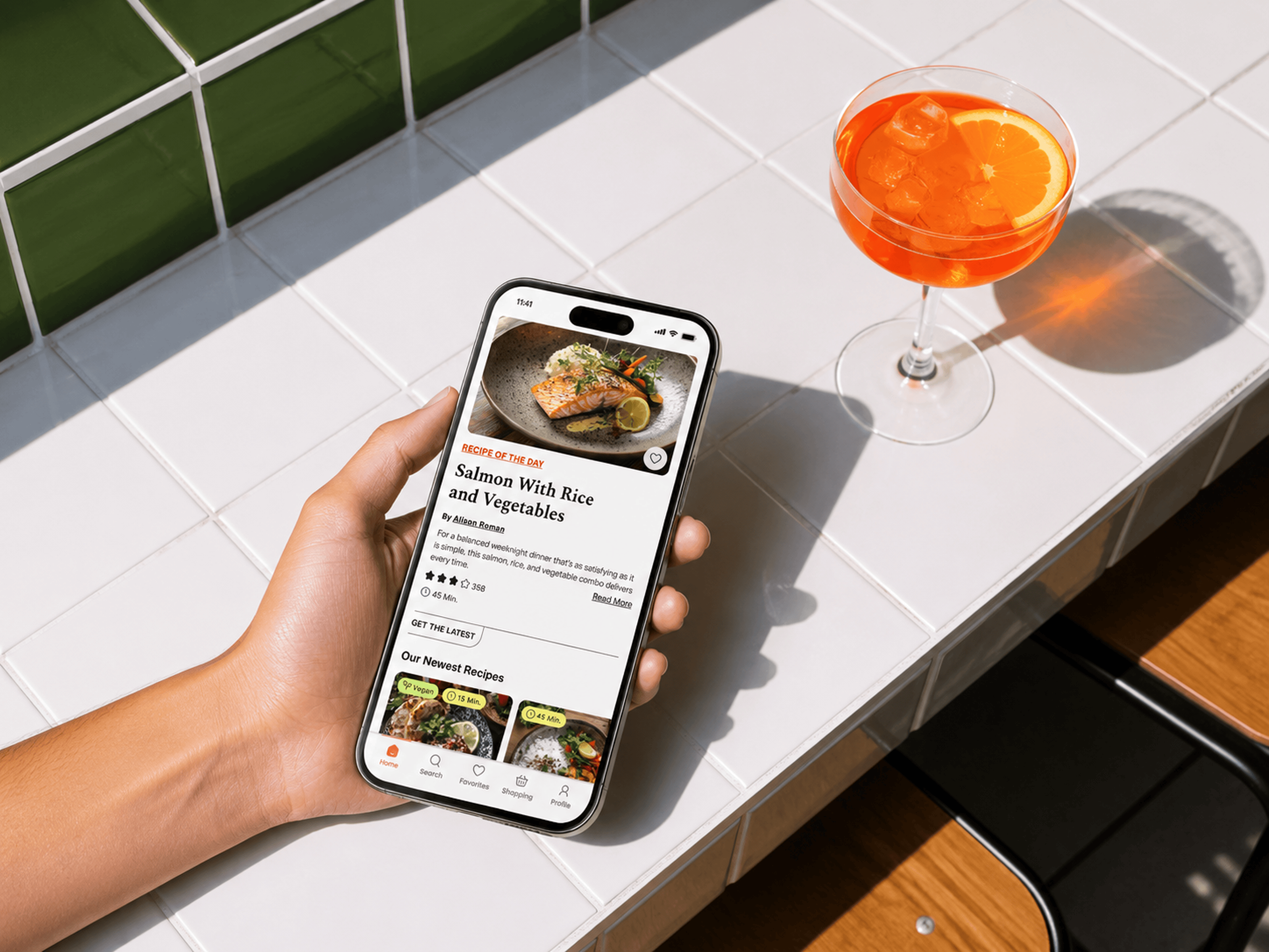
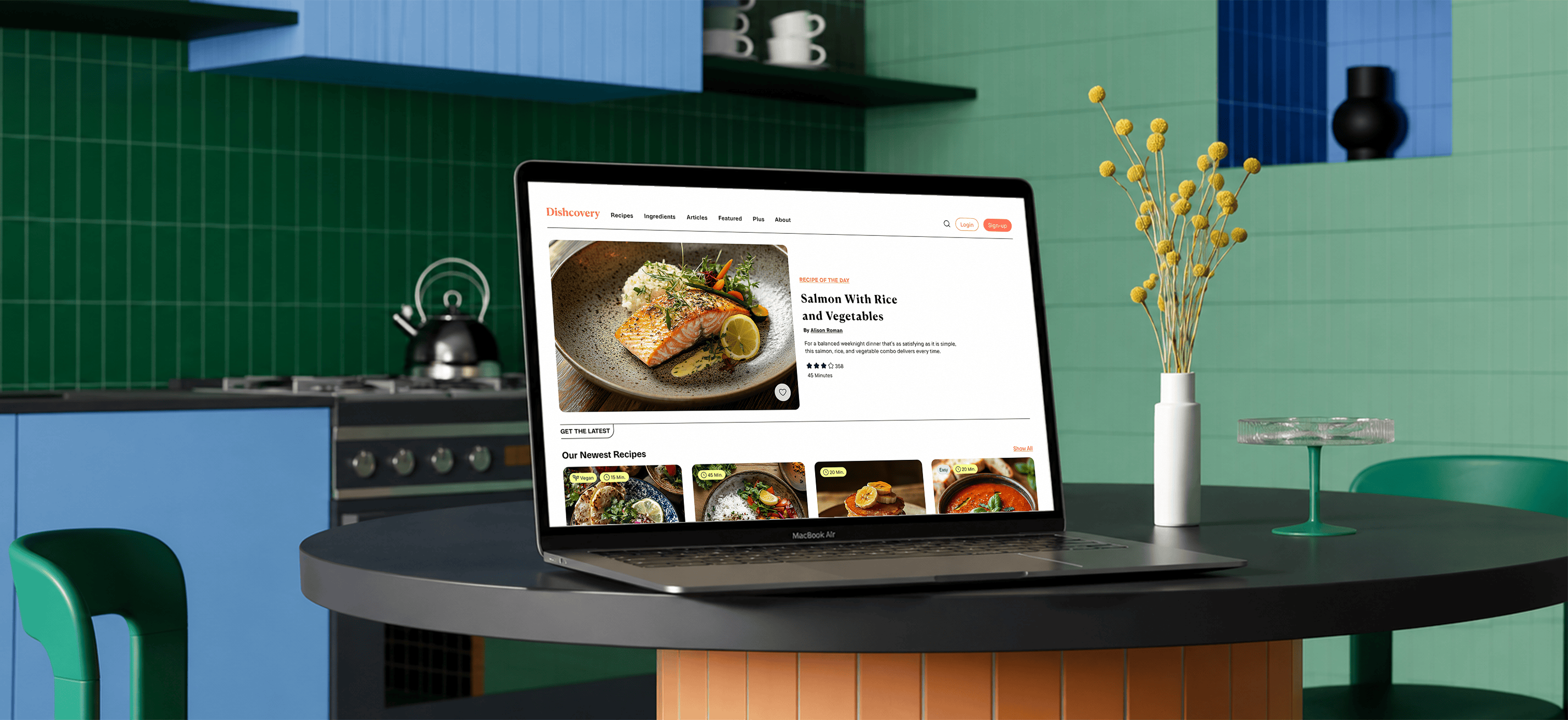
For my UI/UX bootcamp project, I designed Dishcovery, a responsive recipe web app built around making recipe discovery and cooking feel effortless, not overwhelming. Over eight weeks, I moved from research interviews to a tested, iterated prototype, documenting my decisions, mistakes, and learnings along the way.
Recipe content is everywhere, apps, blogs, YouTube, TikTok — yet many people still default to what they already know how to make. Early conversations revealed why: existing tools feel built for food enthusiasts, not everyday cooks trying to get dinner on the table on a Tuesday night. Too many results, too many ads, and recipes that assume too much. That gap between abundant content and a poor everyday experience became the foundation for Dishcovery.
- Project
- Recipe App · Responsive Web
- Role
- UX / UI Designer
- Team
- Solo / Bootcamp
- Duration
- 8 weeks
- Tools
- Figma · AI · Photoshop
Research approach
Understanding the Everyday Cook
I recruited five participants through Slack communities, a mix of working professionals, students on a budget, and a parent managing family meals. All of them cooked two to five times a week and occasionally turned to online recipes for inspiration, though none relied on a recipe app as a daily habit.
I chose this mix deliberately. I didn’t want to talk to cooking enthusiasts. I wanted to understand the casual cook: the person who’s opening the fridge at 6pm and figuring it out.
Three key patterns emerged from the interviews:
Ingredient-first decisions
I usually decide what to cook based on whatever ingredients I already have at home.
Simplicity over ambition
I tend to avoid recipes with long ingredient lists or hard-to-find items. I prefer quick, practical meals.
Scattered discovery
I usually Google or use Instagram for recipe inspiration and tend to pick options that look appealing or highly rated.
Surprising insight
The biggest insight wasn’t about any specific app feature, it was that most participants actively avoided recipe apps, even though they cooked regularly. The apps felt like they were built for someone else.
This shifted my focus. The problem wasn’t a missing feature , it was a missing fit between what users actually needed and what current tools offered.
Pain points
Where the Experience Breaks Down
Through the interviews, I identified three core pain areas that kept casual cooks from sticking with any recipe tool.
Disorganized recipe saving
Users save recipes across multiple platforms, screenshots, bookmarks, links — and struggle to find them later.
Friction during cooking
Users need to scroll, re-read steps, or unlock their phone repeatedly, disrupting the cooking flow.
Inefficient discovery
Too many options, intrusive ads, and limited filtering (e.g. time, difficulty) make it hard to quickly choose simple, relevant recipes.
Competitive analysis
Where the Market Falls Short
Before jumping into solutions, I wanted to understand the landscape. I focused on two platforms that represent opposite ends of the market: Allrecipes and NYT Cooking.
- Free, ad-supported
- Largest recipe database
- Community-generated content
- Subscription-based
- Expert-tested recipes
- Editorial-quality content
- Huge volume of recipes
- SEO dominance
- Strong community & reviews
- Trusted NYT brand
- Meal planning tools
- Clean, focused experience
- Intrusive ads disrupt UX
- Limited personalization
- Less video content
- Paywall may deter users
- Less user-generated content
- Subscription fatigue risk
- Ad clutter hurts navigation
- Basic filtering options
- Frequent sign-up prompts
- Paywall limits discovery
- No AI-powered features
- Limited personalization
Key insight
Both platforms sacrifice simplicity, one through ad clutter, the other through a paywall. Neither truly solves the problem of a distracted, time-pressed user who just wants to cook something simple with what they already have.
NYT Cooking — SWOT
I went deeper on NYT Cooking because it’s the closest to what I wanted to build in terms of quality and focus. Understanding where it falls short was especially useful.
Strengths
- Subscription model = no ads, clean UX
- Trusted, authoritative brand
- Professional recipe testing
Weaknesses
- Paywall blocks casual users
- Low user-generated content
- No AI or smart ingredient features
Opportunities
- AI-powered personalization
- Nutrition & dietary filtering
- Smarter onboarding before paywall
Threats
- Free competitors with large libraries
- Subscription fatigue
- Video-first competitors (TikTok, YouTube)
The design opportunity
Build something that feels as polished as NYT Cooking, but as accessible and practical as possible for the user who’s cooking on autopilot.
Problem statement
“How might we help people who avoid recipe apps quickly find and follow simple meals without feeling overwhelmed?”
This framing kept me grounded throughout the project. Every design decision came back to this question: does this make the experience simpler and more useful for someone who just wants to cook?
Persona
Meet Deniz
Based on the interview patterns, I built one primary persona. I deliberately avoided making her a food enthusiast. She represents the mainstream: someone who cooks regularly but has been let down by existing tools enough times that she’s stopped trying.

Deniz
Data scientist (full-time)
I want to try new recipes, but searching through too many options takes time, so I stick to what I already know.
Bio
A time-pressed, spontaneous professional who prioritizes healthy eating but typically cooks on the fly rather than planning meals ahead.
Key behaviors
- Cooks 3–5 times per week, mostly in the evening
- Rarely plans meals ahead of time
- Opens the fridge first, then decides what to cook
- Searches online but gets overwhelmed and abandons apps
- Screenshots or bookmarks recipes but rarely revisits them
Goals
- Find meals based on ingredients she already has
- Keep cooking simple after long workdays
- Save and revisit her favourite recipes without hassle
Pain points
- Too many options with no way to filter by what’s realistic
- Ads and pop-ups that interrupt the cooking flow
- Recipes that take too long or require too many ingredients
- Having trouble finding recipes after saving them
Tech behavior
- Comfortable using mobile apps
- Prefers quick interactions over browsing
- Avoids apps that require too many steps or decisions
User testing
What Did the Users Say?
Once I had a working prototype, I tested it with three participants, all regular home cooks with different dietary needs and cooking habits. I kept the tasks focused and realistic:
- Search for a recipe using filters.
- Save a recipe to a cookbook.
- Edit or delete a saved recipe or cookbook.
- Add ingredients to the shopping list.
What I measured
- Time required to complete key tasks
- Ease of navigation and feature discoverability
- Points of confusion, errors, and friction during task completion
Outcome
All participants completed every task successfully. But “completed” isn’t the same as “smooth.” Three clear friction points emerged:
- 01Navigation took longer than expected because icon-only labels weren’t immediately clear.
- 02Some filter labels were ambiguous, users weren’t sure what certain categories meant.
- 03The Cookbook creation flow had one redundant confirmation step that slowed people down.
These weren’t catastrophic failures, but they were exactly the kind of small friction I needed to eliminate.
Iteration
Let’s Iterate & Refine
I made focused changes to address each friction point directly.
Navigation
During initial usability testing, I used a hamburger menu along with icons for the shopping list and saving recipes. While users were able to locate these icons, they required additional time to recognize their functions and complete tasks. This indicated a gap between discoverability and efficiency.
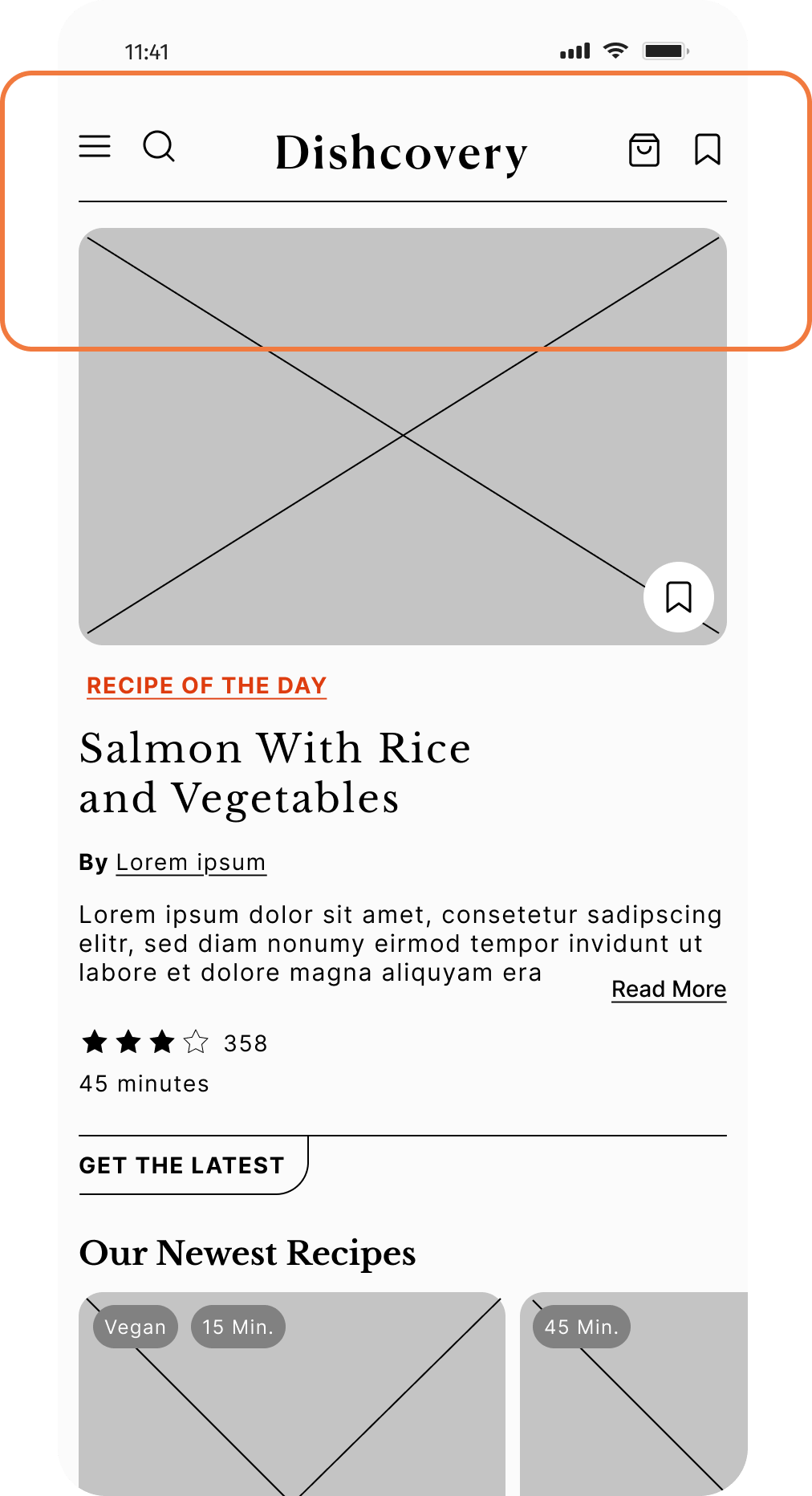
My initial design used a hamburger menu with icons for the shopping list and saved recipes.
⚠ Users could find the icons, but needed extra time to understand their purpose and complete tasks.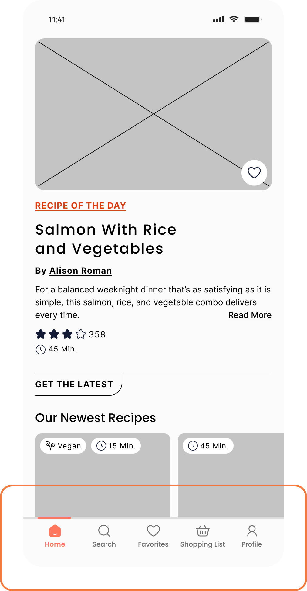
I replaced the hamburger with a persistent bottom navigation bar to improve feature visibility and reduce cognitive load, enabling faster task completion.
Filter
In the initial design, filters were hidden within expandable sections, and some category labels were unclear to users. To reduce ambiguity, I redesigned the filter screen using labeled chips and supporting icons. This made the filter options easier to scan and helped users understand categories without needing to explore multiple sections.
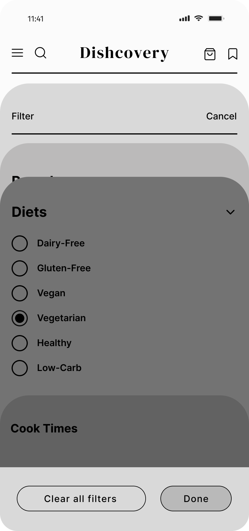
Filters lived inside expandable accordions, and several category labels were ambiguous.
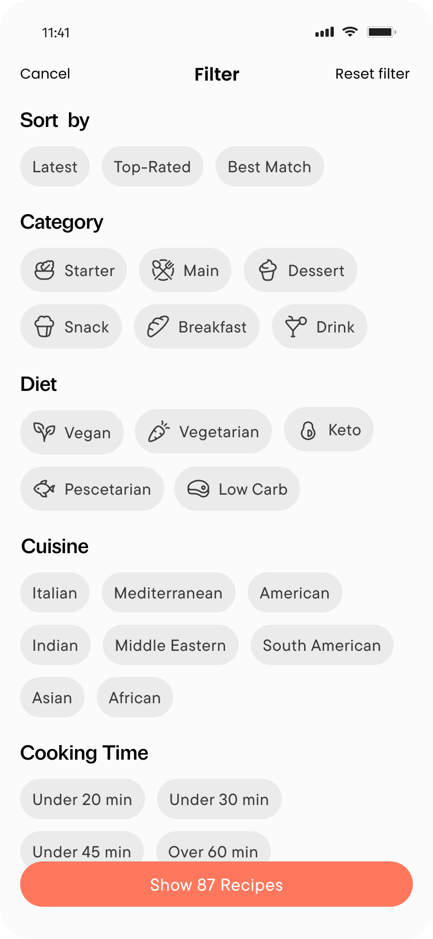
Labeled chips with supporting icons made every option scannable at a glance — no digging through sections required.
Solution
From Insight to Solution
The final solution comes together across three core flows, each one answering a friction point that surfaced in research and testing.
Flow 1: Smart Filters
The original discovery flow focused on smart filters: users could narrow recipes by cooking time, dietary needs, difficulty, and cuisine. This directly addressed the research finding that people felt overwhelmed by too many options with no meaningful way to filter them down to something realistic.
Fridge Finds
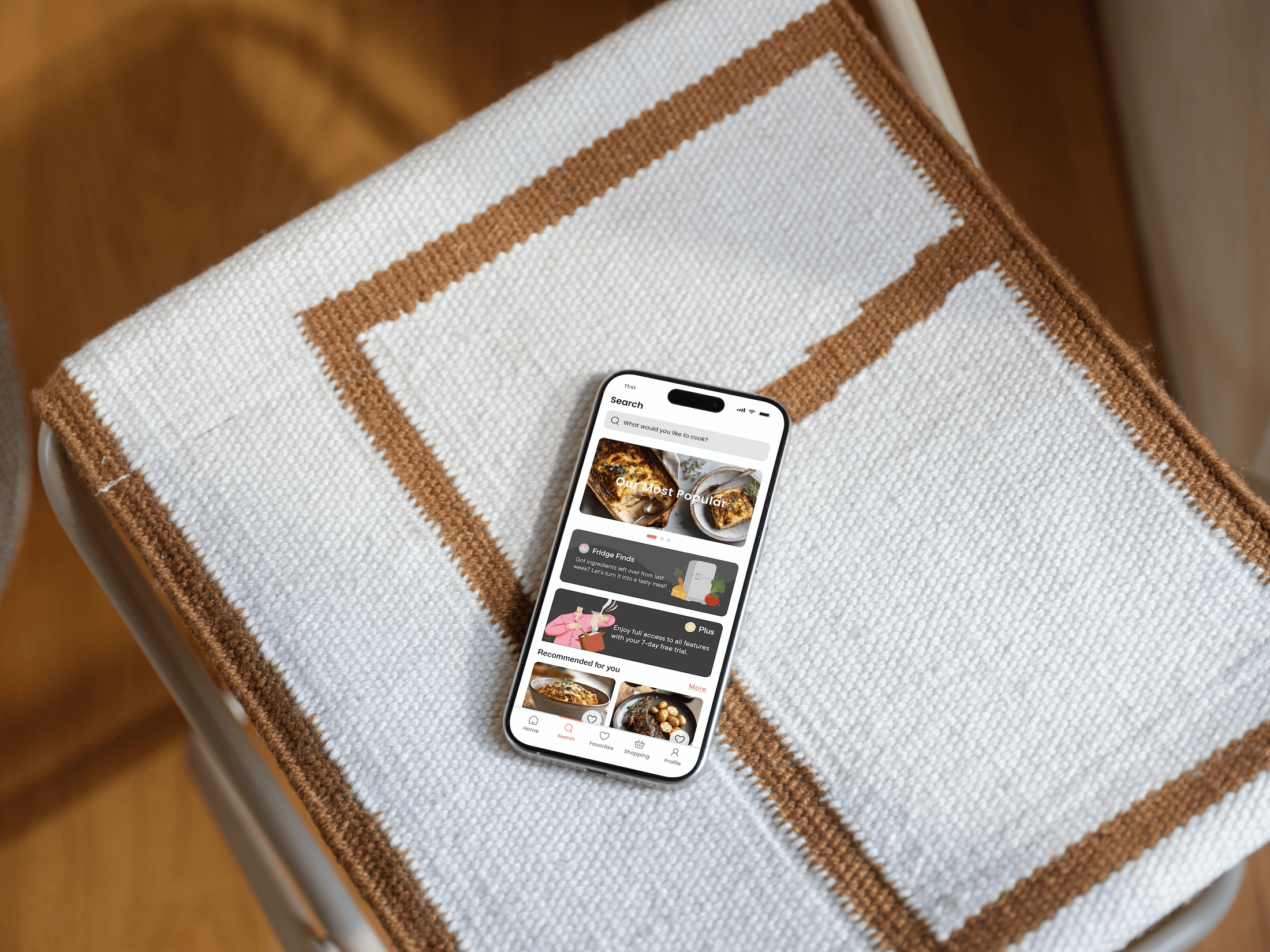
When I revisited the project after the bootcamp, I noticed a gap. My research had surfaced a clear behavior — people decide what to cook based on what’s already in their fridge, but the original design hadn’t fully solved it. Filters help you narrow a search, but they still require you to know what you’re looking for. That’s a different problem.
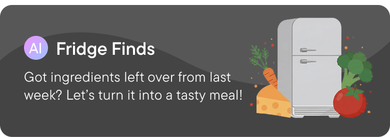
That’s when I added Fridge Finds. AI had become a more accessible tool in product design, and this felt like a genuine use case rather than a trend to follow: type in what you have, and the app generates relevant suggestions. No browsing required. It wasn’t part of the original brief, but it was the natural answer to something users had told me from the very first interview.
Flow 2: Saving and Organizing Recipes
Every participant mentioned the same problem: recipes scattered across tabs, screenshots, and bookmarks. I designed a Cookbook feature, a centralized space where users could create named collections, save recipes with one tap, and import content from external sources.
The goal wasn’t to add complexity. It was to give users one place they could trust to hold their recipes, so they’d actually use them.
Flow 3: Cooking Mode
This was the flow I felt most strongly about. In research, every participant described the same friction: phone goes to sleep mid-recipe, steps are too long to read quickly, you’re constantly touching a screen with oily hands. I designed a dedicated cooking mode with large text, one step at a time, a persistent screen, and visual cues for each stage.
The cooking mode wasn’t a nice-to-have. Based on research, it was the single biggest friction point, and solving it felt like the clearest opportunity to make a real difference.
Reflection
What I Learned
How my mindset changed during the project
I started this project thinking like a visual designer — I wanted to make something that looked good — but throughout the project I learned that understanding users is the foundation of effective UX.
What would I do differently
If I were to redesign this project today, I would spend more time planning the research phase, refining interview questions, and validating assumptions earlier to gain deeper insights into users’ needs and pain points.
How this project shaped my process
It showed me the value of research-driven design and encouraged me to rely less on assumptions and more on real user feedback.
A lesson about iteration
I learned that user testing is an important part of the design process, and that even small insights from users can lead to impactful design improvements.