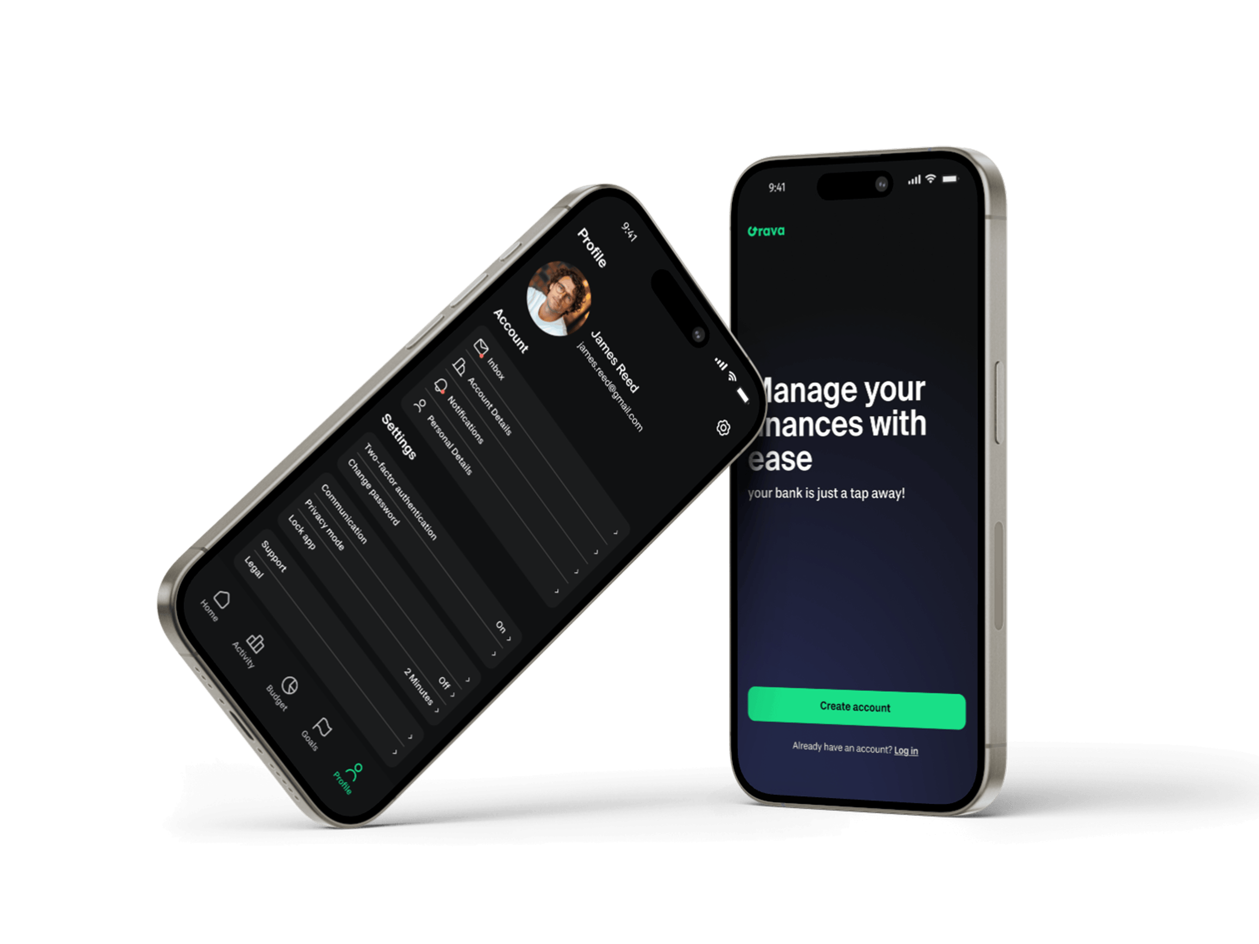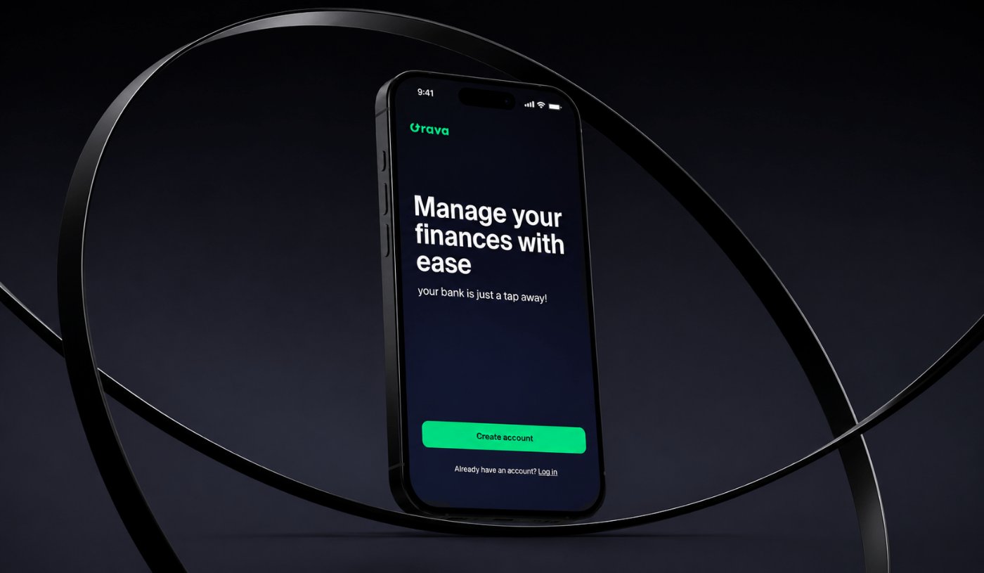
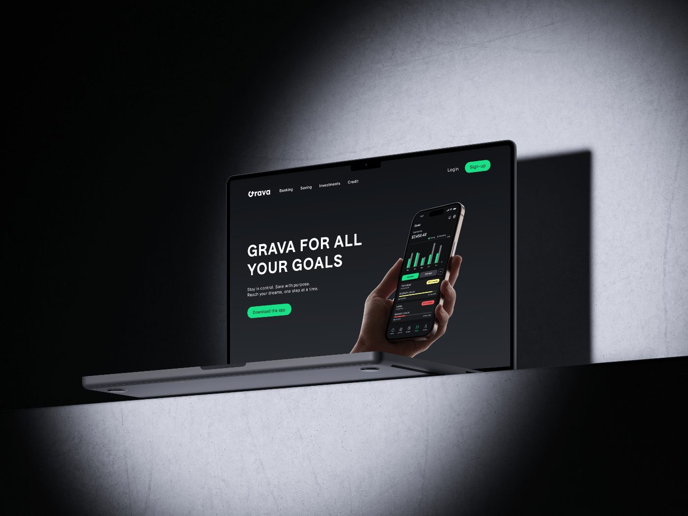
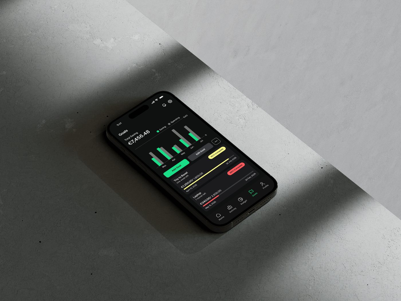
Fintech · End-to-end UX/UI · 4 weeks
Grava — Fintech App
Context
Managing money can feel overwhelming for many young adults, especially when financial tools add complexity instead of clarity.
I created Grava to address that challenge. My goal was to design a savings app that helps young adults build better financial habits through a simple, goal-focused experience.
Over four weeks, I took the project from initial research to a fully designed and tested mobile product: user flows, wireframes across three fidelity levels, usability testing, and final visual design.
- Project
- Fintech App
- Role
- UX / UI Designer
- Team
- Solo / Bootcamp
- Duration
- 4 weeks
- Tools
- Figma
Research & insight
Let's Understand the Problem
Before I opened Figma, I spent time asking a simple question: what actually stops young adults from managing their money well?
The project brief included user stories that defined the core needs I was designing for. I used these as my starting point and cross-referenced them against existing apps, including N26 and Finanzblick, to understand what was already being solved and where the real gaps were.
What I found in that competitive research was telling. N26 does a solid job of transaction clarity and a clean visual hierarchy, but its savings features feel passive — you save by default, not by intention. Finanzblick gives power users a lot of data, but it’s overwhelming for someone who just wants to know if they’re on track. Neither app made goals feel motivating or personal. That gap became Grava’s design opportunity.
From the brief and competitive research, four pain points emerged consistently:
Generic advice doesn’t stick.
Financial apps serve the same recommendations to everyone. Users wanted an app that reflected their own habits and goals.
Goals without structure fail.
Setting a savings target isn’t enough. Without a timeline and visible progress, motivation disappears fast.
Tracking income and expenses is scattered.
People juggle bank apps, notes, and spreadsheets because nothing gives them a clear, combined view.
The dashboard is usually the problem.
Most apps dump too much data on the home screen. Users struggle to find the one number they actually care about.
These four needs gave me something concrete to design against. I shaped them into a single design question that guided every decision I made afterward:
“How might we create a personalized financial management experience that helps users track income and expenses, set achievable savings goals, and visualize their spending habits in a clear and motivating way?”
Ideation & iteration
First Drafts and Ideas
With the problem framed, I started sketching. My approach was to begin with structure before style, figuring out how to organize information before deciding how it should look.
I worked through each core screen in pairs: a rough version first to establish hierarchy, then a more detailed version that introduced real content and meaningful interactions. Here’s how each screen evolved:
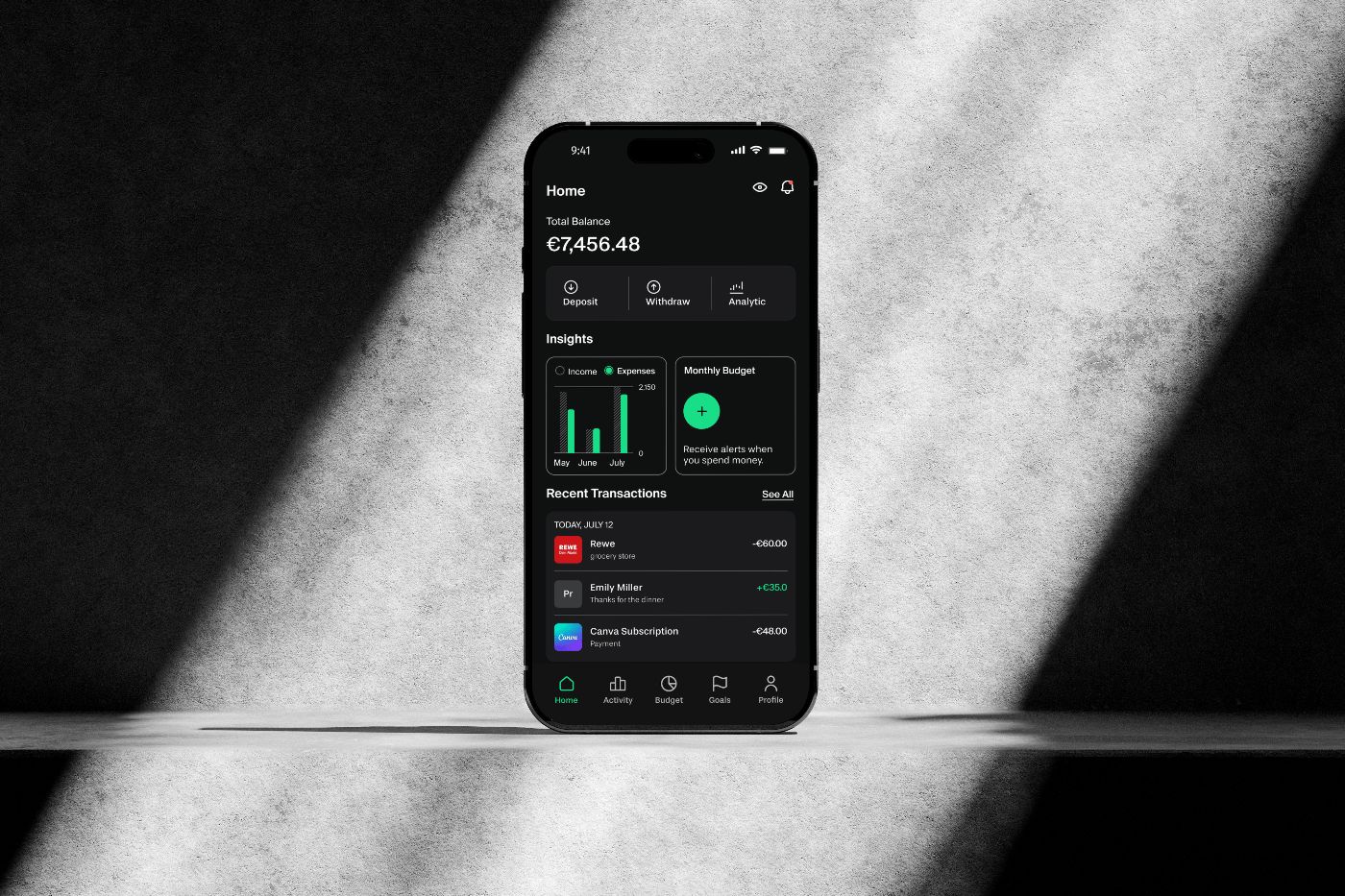
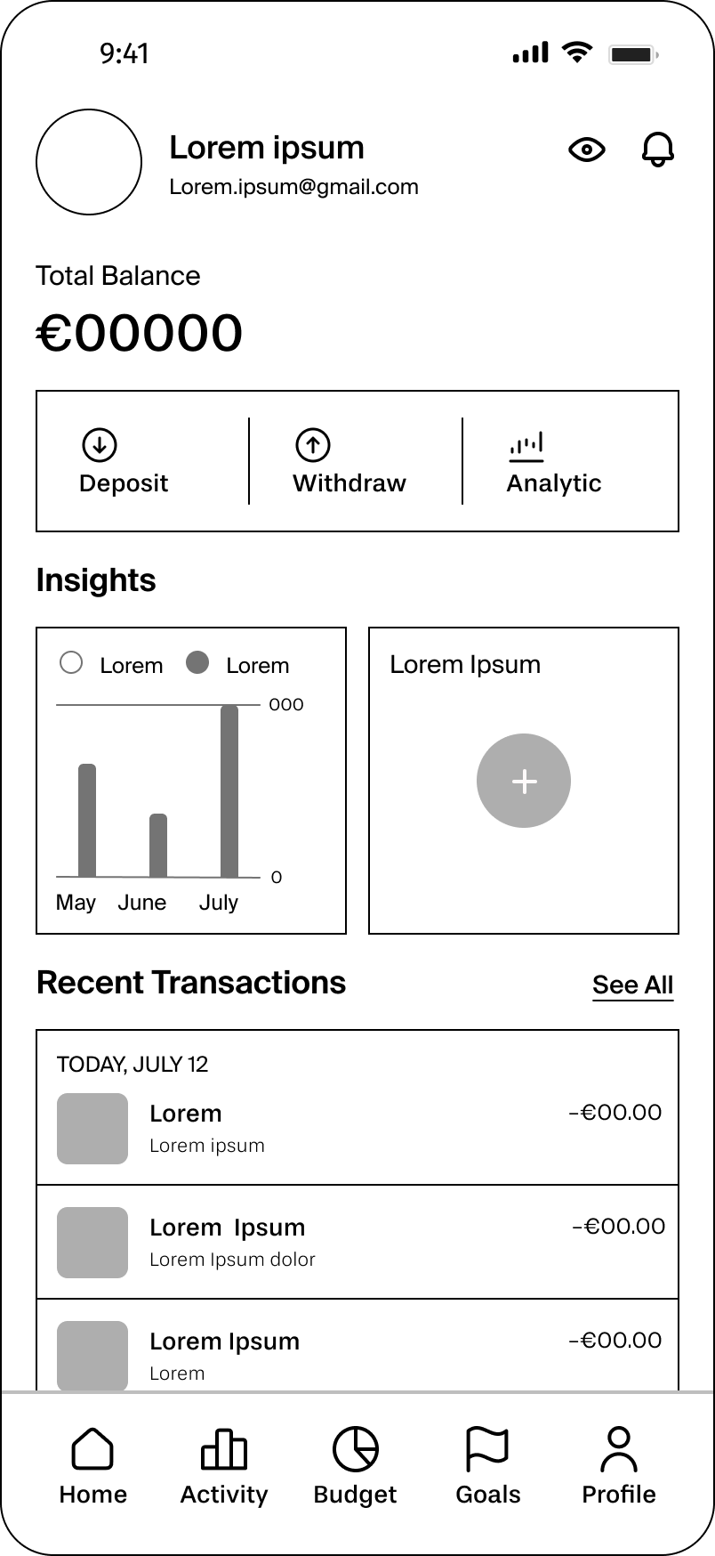
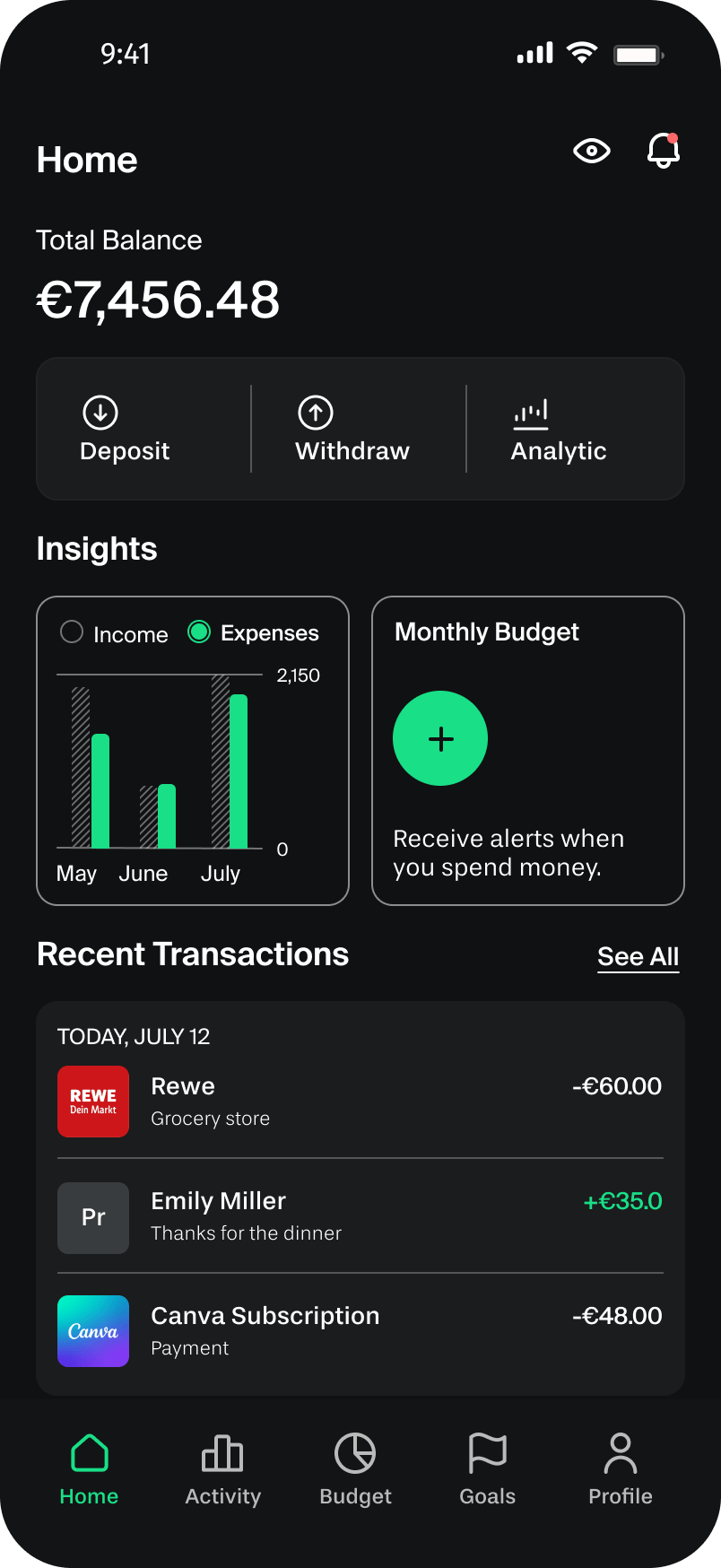
My first version focused purely on content hierarchy: balance at the top, quick actions next, then Insights and Recent Transactions below.
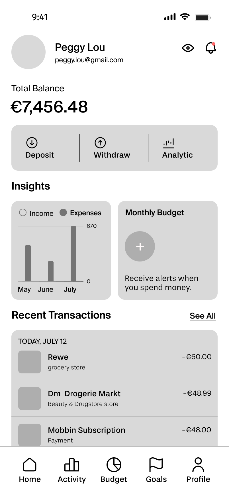
In the second pass, I added real data and split the Insights section into an income-vs-expenses chart and a Monthly Budget card. The goal was to make the “so what?” obvious at a glance — see your money, act on it.
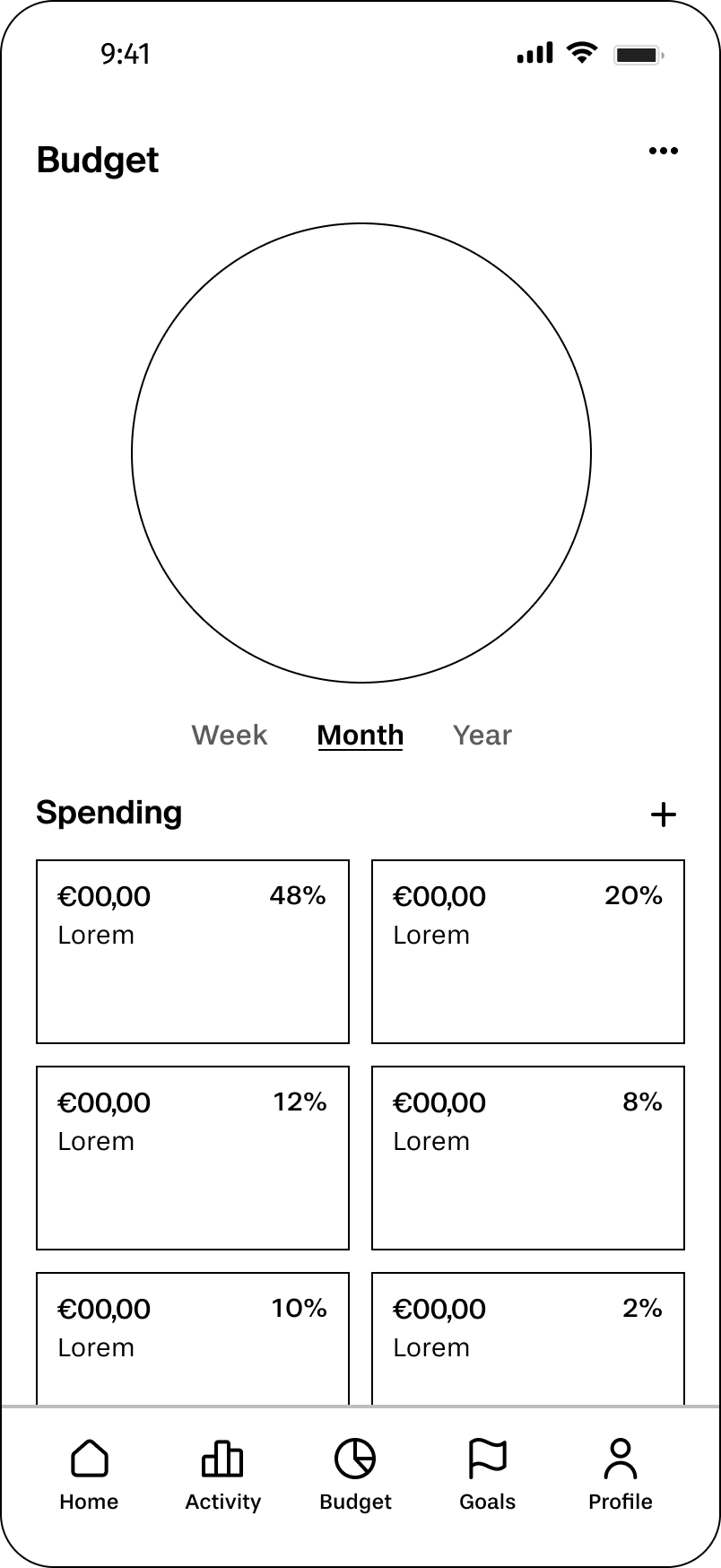
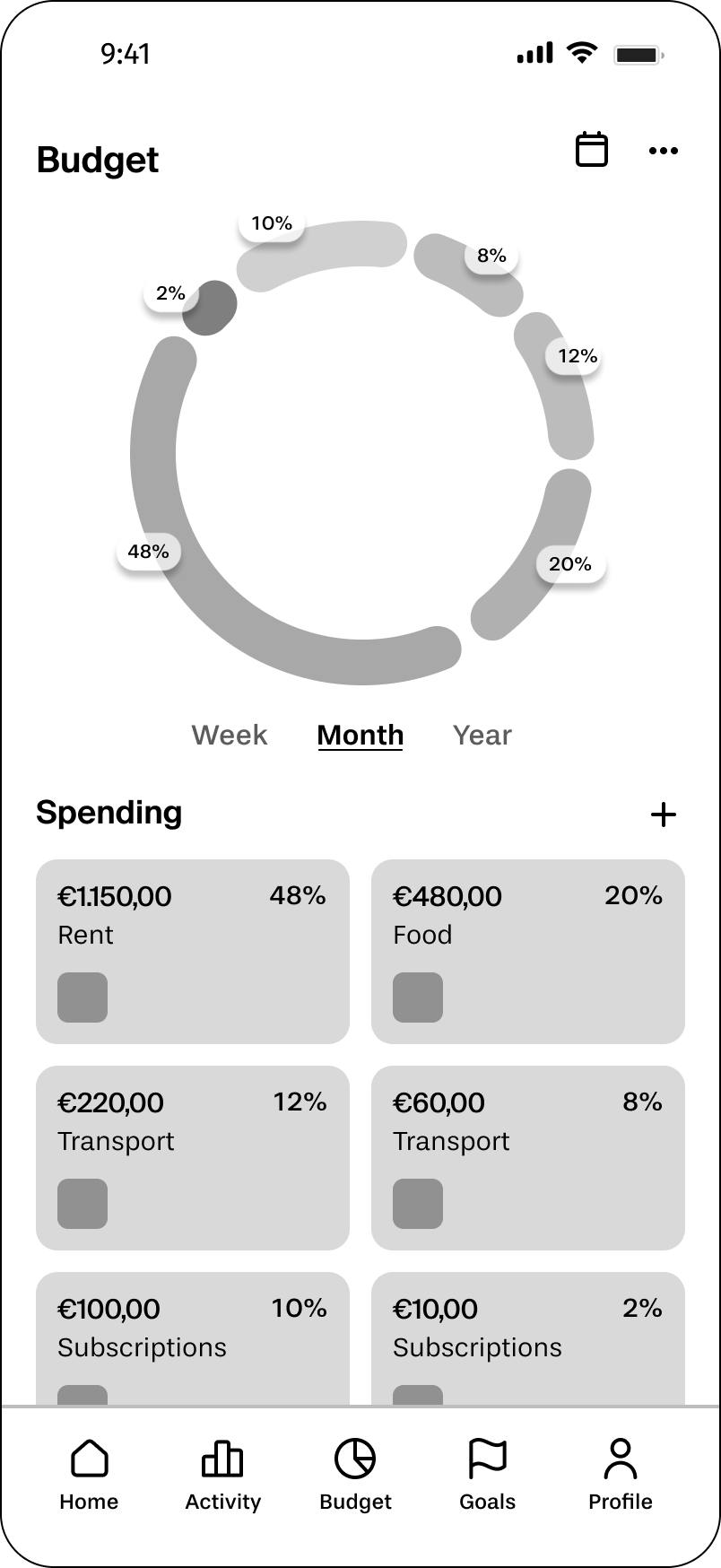
I started with a donut chart at the top and a category breakdown below. Simple, scannable.
In the iteration, I added real spending amounts, percentage labels, and category names. This made it possible to compare spending patterns quickly, without having to do mental math.
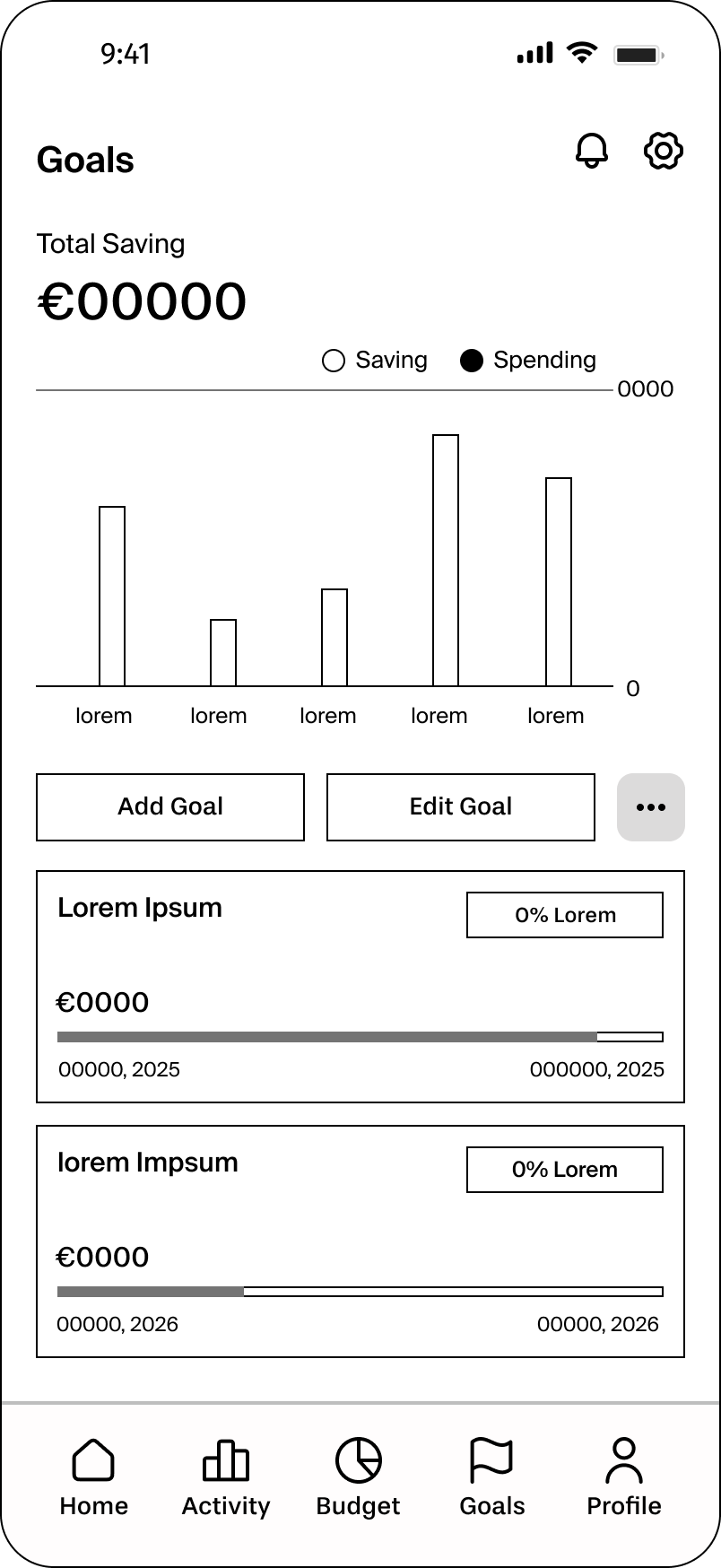
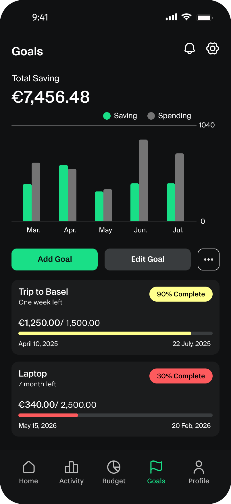
This was the screen I cared most about getting right, because goals are the emotional core of the app. My first version used plain goal cards and a basic bar chart.
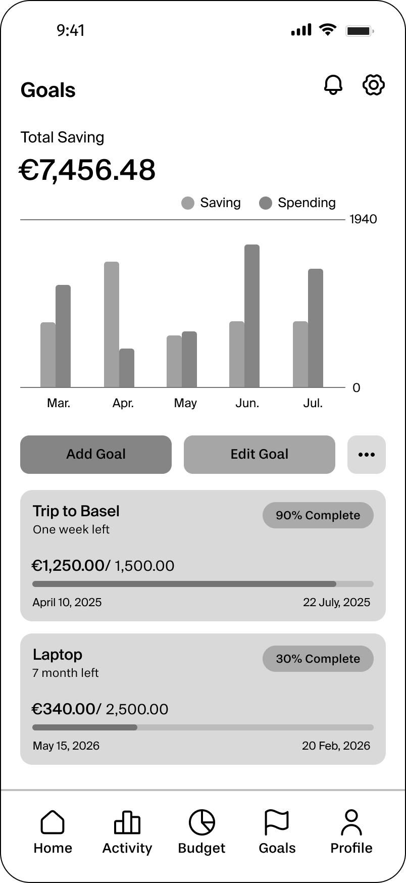
In the second pass, I introduced progress indicators, completion percentages, and timelines (e.g., “Trip to Basel — 90% Complete, one week left”). Seeing how close you are to a goal is motivating; seeing a raw number isn’t.
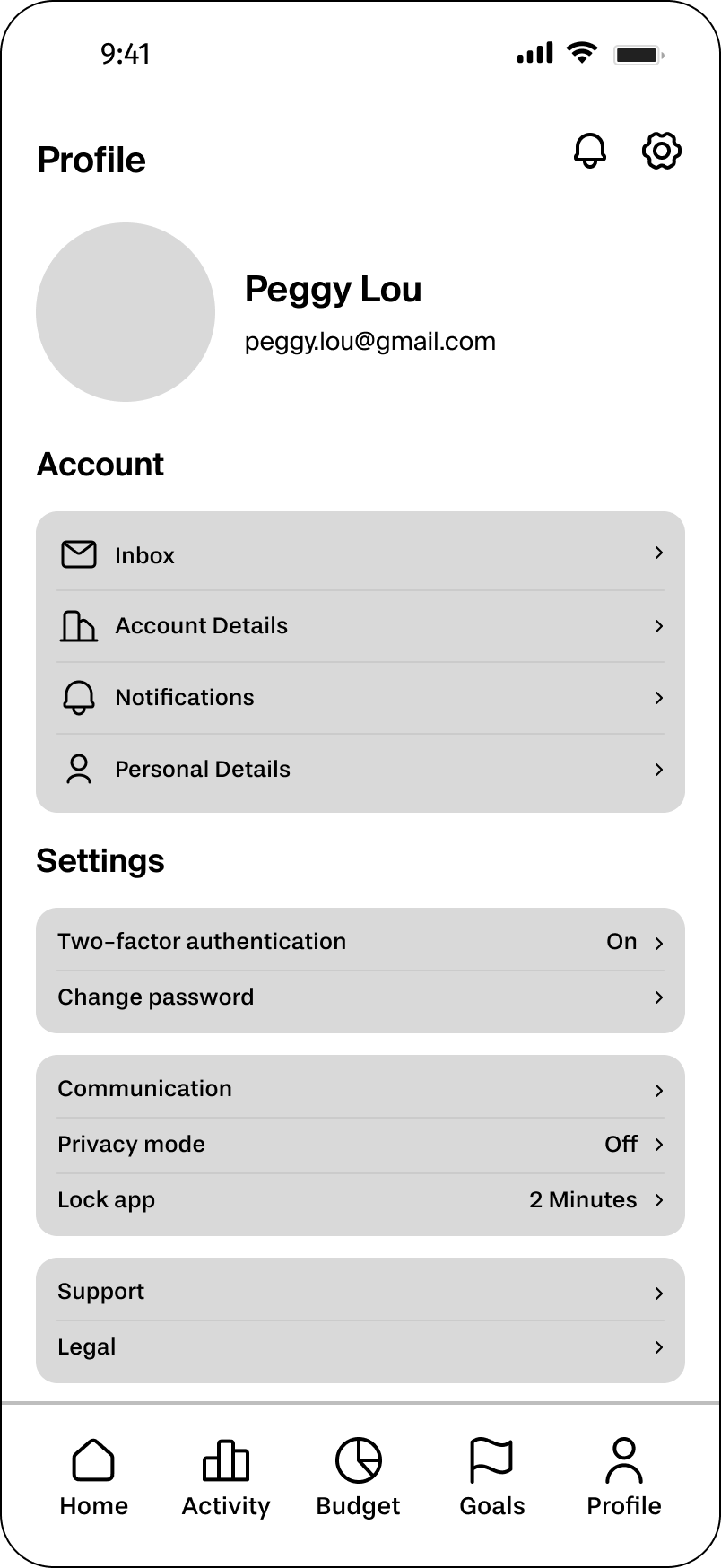
Even the Profile screen got a thoughtful iteration. I split settings into Account and Settings sections.
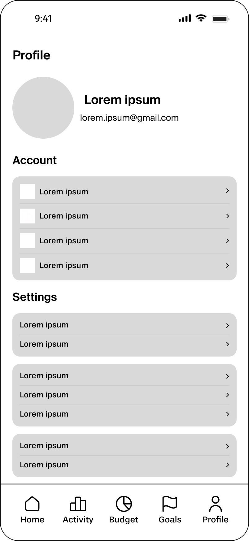
Then I added descriptive labels and supporting icons to make navigation clear and scannable. At each step I asked: does this answer the user’s actual question — does this help someone understand their finances faster?
User testing
What Did the Users Say?
Once I had developed mid-fidelity wireframes I was reasonably confident in, I tested them with three participants. I kept the tasks focused and realistic:
- Creating a savings goal.
- Setting a monthly budget.
- Navigating to check their transactions.
Participant feedback
Missing confirmation feedback
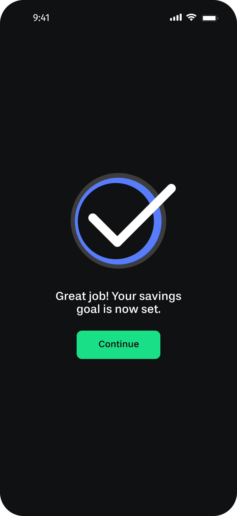
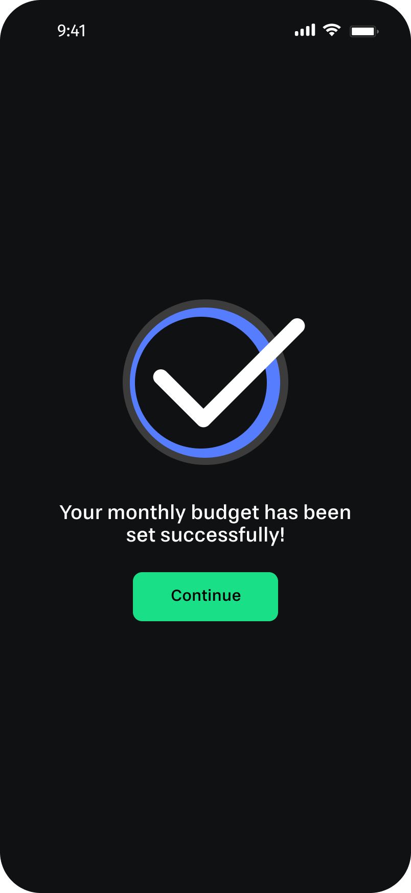
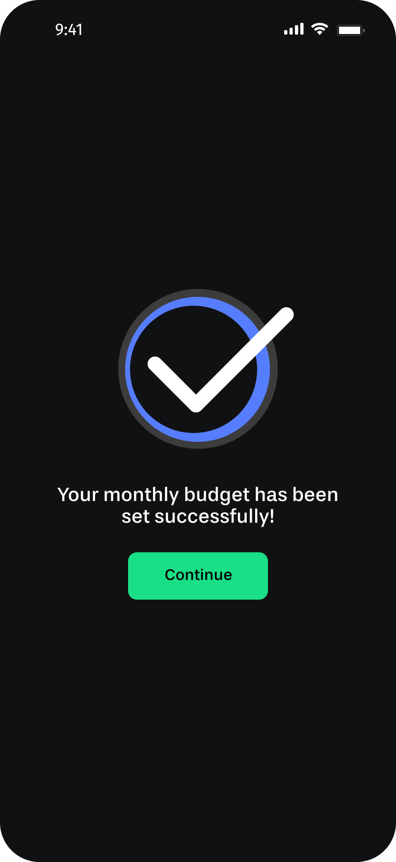
All three users completed their goals and budgets successfully, but they weren’t sure if it worked. There was no moment of “done.” They asked for confirmation messages after completing each action.
Budget guidance
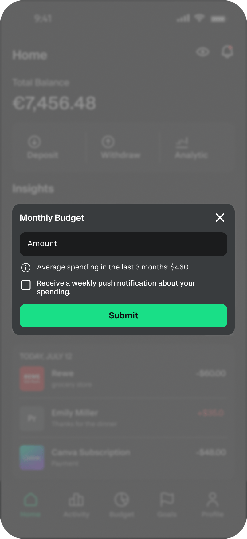
Users wanted help setting realistic budgets. One participant asked, “How am I supposed to know what to put here?” A reference point, like average spending from the past three months, would have helped.
Dashboard clarity
The income-vs-expenses chart was confusing. Users weren’t sure which bar represented which; the chart needed clearer visual differentiation.
Visual engagement
The wireframes felt flat. Users wanted more color and visual richness, which matters especially in a goal-tracking context where motivation is part of the product.
Iteration
Let’s Iterate & Refine
I made focused changes to address each theme directly:
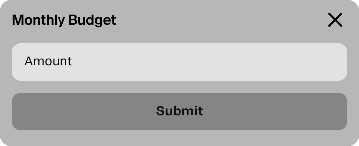
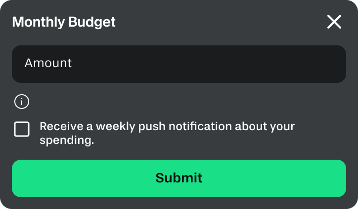
I updated the monthly budget modal to include a 3-month average spending reference and an optional weekly notification to help users stay on track. This gave users a starting point instead of a blank field.
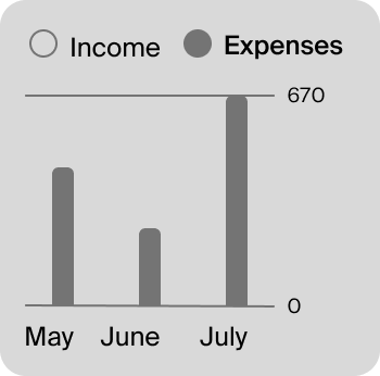
Users found the income and expense chart confusing.
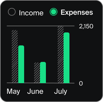
I added color differentiation to the income-vs-expenses chart and introduced radio-button selectors to make it explicit which view was active.
I added success screens after both goal creation and budget setting, a checkmark, a short confirmation message, and a “Continue” button. A small change with meaningful impact: users now knew their action was registered.
Key flows
The Final Screenflows
With the iterations complete, I documented three core user journeys that show how all the pieces connect.
Flow 1: From onboarding to a complete financial overview
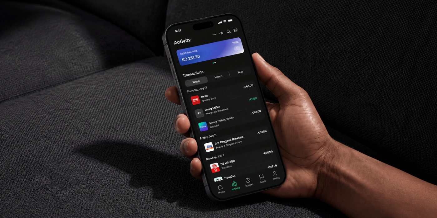
I designed the entry flow to help users reach their financial overview quickly and easily. The onboarding screen introduces the app’s value, the login keeps required information minimal, and the Home dashboard gives users everything relevant to their current financial state immediately. Users can then explore the Activity tab for a more detailed view of their transactions. The whole flow takes under a minute.
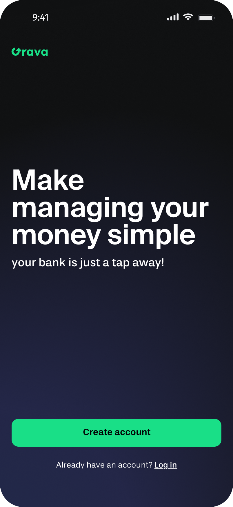
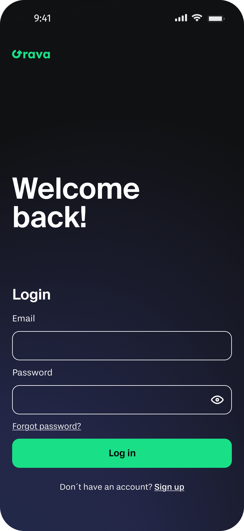
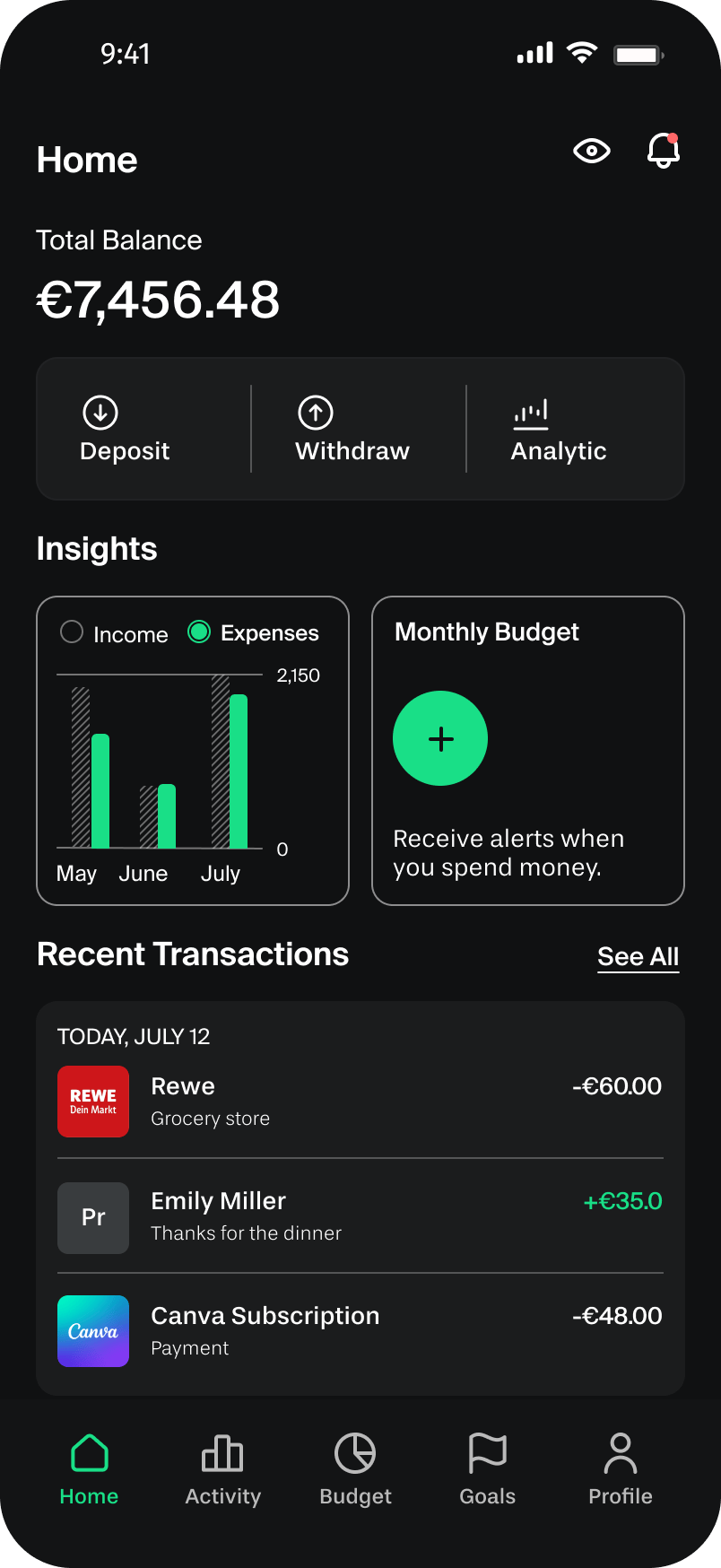
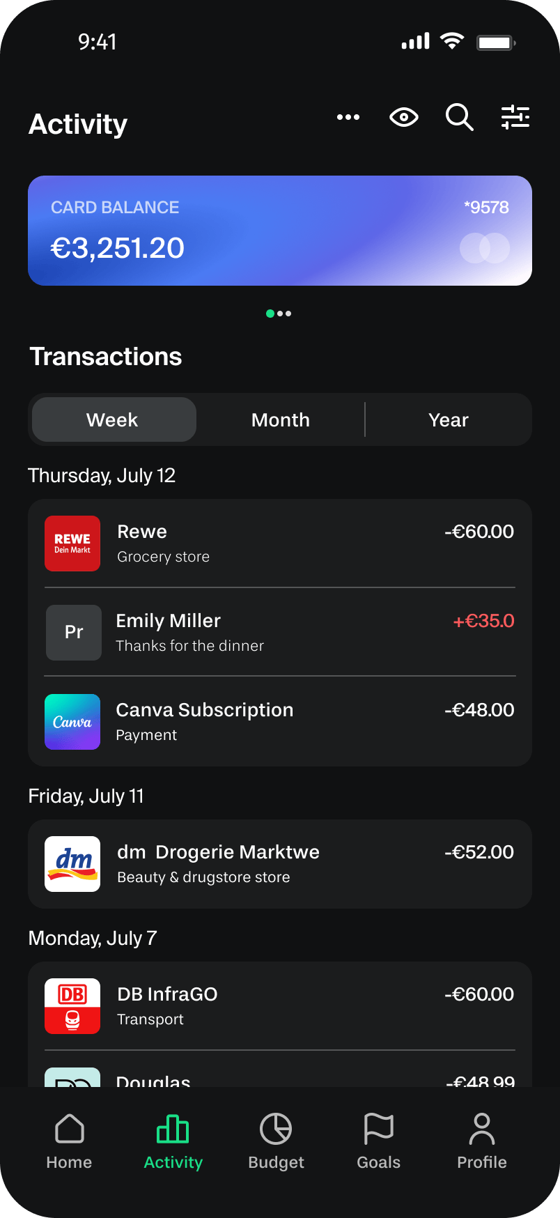
Onboarding → Log in → Home dashboard → Activity
Flow 2: Setting a monthly budget
To help users gain financial clarity quickly, I developed a dashboard combining their total balance, income and expense overview, monthly budget, and recent transactions on a single screen. The goal was a low-friction experience where users could understand their finances at a glance and make informed decisions, developed through a simple three-step process.
Home dashboard → Monthly budget modal → Confirmation
Flow 3: Setting a savings goal
I created a goals dashboard with goal cards, progress bars, completion percentages, and timelines to help users set financial goals and track their progress. It gives users a clear view of their savings journey while simple visualizations provide quick insights into spending and saving habits.
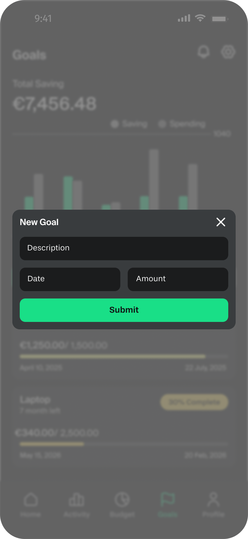
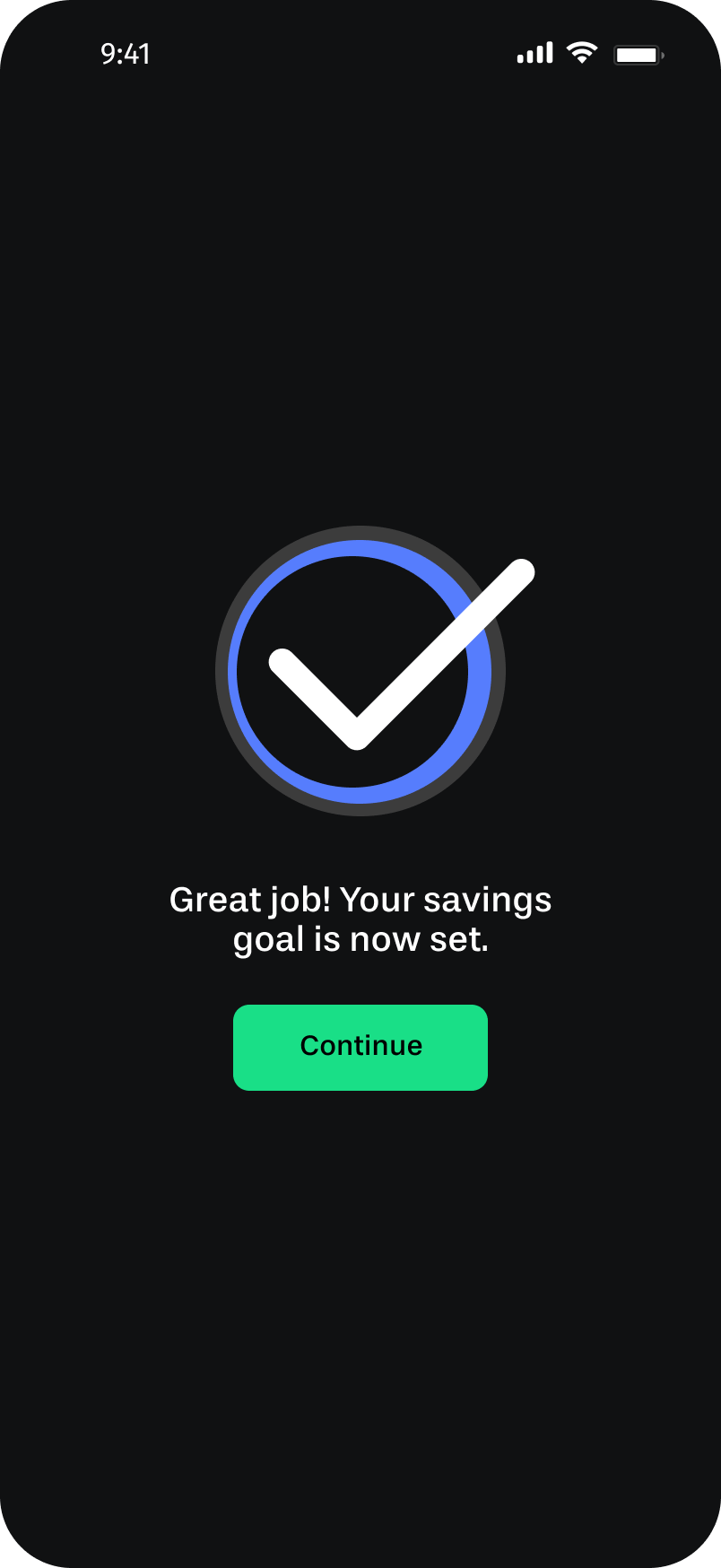
Goals → New goal modal → Confirmation
Reflection
What I Learned
Prioritize core needs
Four weeks and a solo brief forced me to focus. I couldn’t pursue every interesting idea, I had to decide what mattered most to the user and commit to it. Learning to let go of “nice-to-have” features to protect the core experience is a skill I’ll carry into every project.
Design for fintech
Designing for fintech taught me that users are handing an app something genuinely sensitive: their financial reality. Clarity, feedback, and consistency aren’t just good UX practices here, they’re how you earn trust. A missing confirmation screen isn’t just a usability gap, it’s an anxiety trigger. Every interaction needs to answer: “did that actually work?”
Next steps
What I’d Do Next
If Grava continued into a second sprint, three areas would be my priority:
Personalized onboarding
Right now the app starts with a login screen. A short onboarding flow, asking users about their main financial goal and monthly income range, would let the dashboard and budget suggestions feel immediately relevant instead of generic.
Spending notifications
The weekly budget alert introduced after testing was a good start. The next step would be smarter, contextual nudges: a mid-month alert if you’re tracking above your spending average, or a motivational prompt when you’re close to hitting a savings goal.
Savings streaks and milestones
Consistency is one of the hardest parts of saving money. Adding a simple streak mechanic or milestone celebration (e.g., “You’ve saved for 4 weeks in a row!”) would reinforce the habit loop without turning the app into a game.