Event discovery · iOS & Android · End-to-end UX/UI · 4 weeks
Onfoot — Event Discovery App
Context
Sometimes you want to go out without knowing exactly where to go.
Most discovery apps assume you already have a destination in mind — they lead with a search bar and filters. Onfoot was designed around a different idea: helping people discover unexpected experiences in their city, before they’ve decided what they’re looking for.
It was also the most technically demanding project of my bootcamp, because the brief asked for one product built natively for two platforms. That single constraint turned every screen into a decision about where iOS and Android should agree, and where they shouldn’t.
- Project
- Event Discovery App · iOS & Android
- Role
- UX / UI Designer
- Team
- Solo / Bootcamp
- Duration
- 4 weeks
- Tools
- Figma · AI · Photoshop
From brief to concept
An Honest Starting Point
I want to be upfront about something before diving in, because I think honesty makes a stronger portfolio than a polished fiction.
This was a bootcamp assignment. The brief was straightforward: design an app for both iOS and Android. That was it, no concept, no defined problem space, no specified user. The walking-based discovery idea was mine. I chose it because I wanted a premise that would make the platform-specific decisions genuinely interesting to work through, and because it was a space I actually cared about.
I didn’t conduct user interviews. I didn’t run usability tests. What I did was make a product decision first, what should this app be, and why? and then make real design decisions from there: how to structure an app around that concept, what a complete end-to-end experience looks like, and how to build the same product so it feels genuinely native on two very different platforms.
The dual requirement was intentional on the brief’s part. But the direction was mine.
The product decision
Instead of asking “what are you looking for?”, Onfoot says “here’s what’s happening.”
That single structural choice, an editorial feed over a search-first home screen, shaped everything that followed.
Understanding the space
Research Constraints
Without user research, I needed another way to ground my decisions. I spent time with two apps that occupy a similar space, Eventbrite and Meetup. Both are competent. Neither is what I was trying to build.
- Intent, you arrive with a plan
- Search bar + category filters lead the home screen
- Community, groups and niches
- Content is fragmented and interest-specific
- The user who already knows what they want
- Fast, filtered ticket discovery
- Recurring, interest-led gatherings
- People seeking a specific community
- Puts cognitive load in the wrong place for the “no plan” user
- Browsing feels like work
- Visual design feels dated
- Event cards inform, they don’t invite
The opportunity
A feed that leads with editorial curation rather than a search prompt could serve the “no plan yet” user in a way neither app really does. Eventbrite asks you to know; Meetup asks you to belong. Onfoot just shows you the city.
Design objectives
Defining My Own Brief
Since I’d chosen the concept myself, I had to define what I was actually trying to design, not just the app, but the specific design problems worth solving. I landed on three.
Organize content without creating overload
Events, walking routes, editorial collections, and location suggestions all live on one home screen. Too much becomes noise; too filtered loses the discovery quality entirely. The balance was the work.
Design a complete flow, not just a beautiful home screen
Onboarding, browsing, filtering, event detail, checkout, confirmation, error states, saved items, profile. The full journey — including the moments most case studies quietly skip.
Feel genuinely native on both platforms
Not just swapping SF Pro for Roboto. Understanding where the two platforms truly diverge at a component and interaction level, and deciding accordingly at every screen.
Mapping the flow
The Full User Journey
Before touching visual design, I mapped every path from the app opening, discovery, search, saving, profile, and the branching road to a booked ticket.
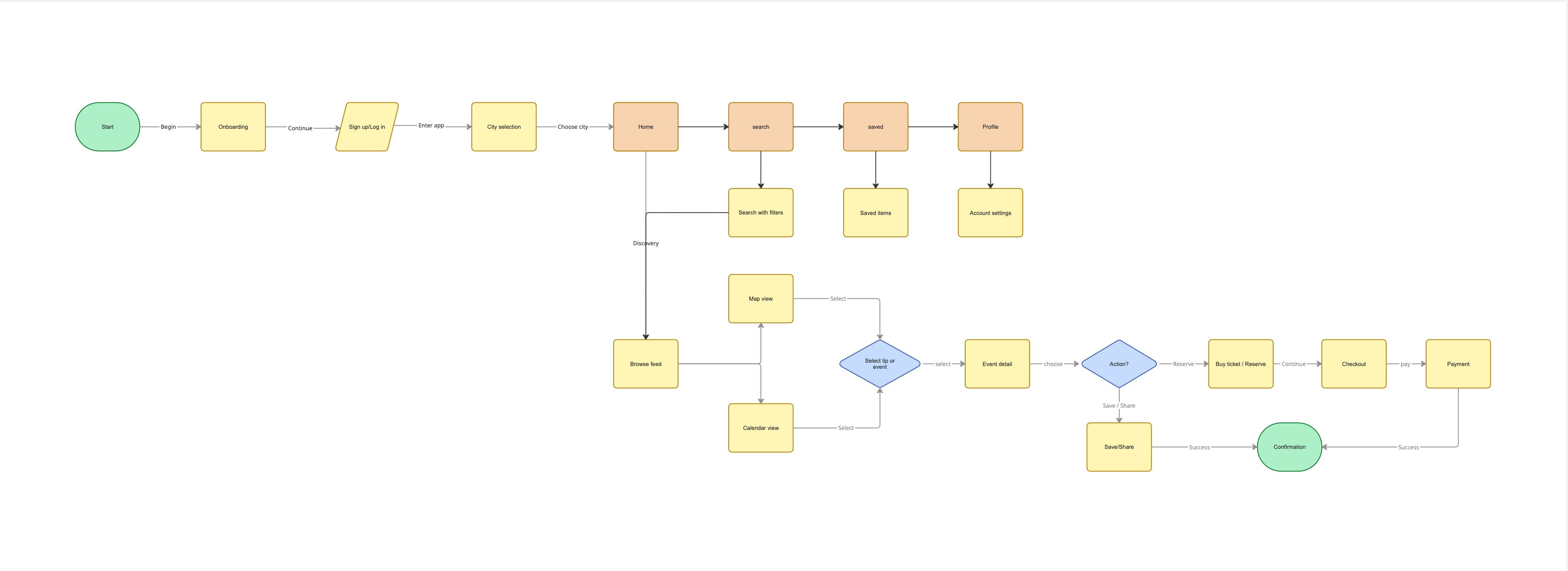
The checkout path splits
For some events, booking happens in-app (a full checkout flow); for others, it redirects to an external partner. Designing both meant the flow needed a clear handoff moment, a screen that tells the user they’re leaving the app, rather than a jarring redirect.
The profile needed real depth
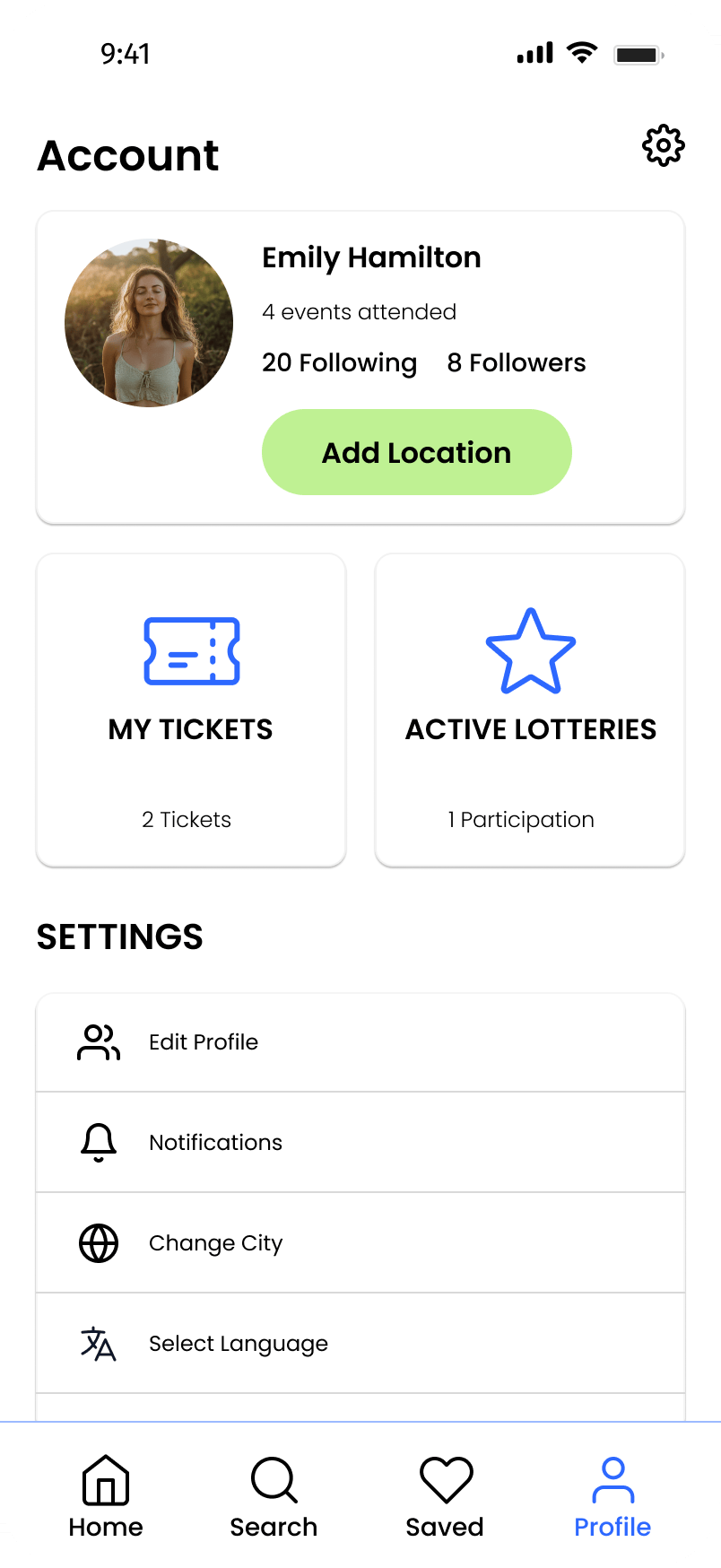
Because the app involves ticketed events and lotteries for high-demand entries, the profile became a functional hub, my tickets, active lotteries, saved locations, settings. Not decoration; it reflects how a real user returns after their first discovery session.
Style direction
Grounded in the City
The visual language needed to feel grounded in the city without becoming generic urbanism. I avoided the predictable dark-mode-with-neon route and built a palette that balances warmth with clarity, then let typography genuinely diverge by platform.
Color
A lime green that connects to the core metaphor: walking, outdoor spaces, nature within the city.
Typography
Here the platforms genuinely diverge, a deliberate choice, not a default.
Ag
Aa Bb Cc 123
SF Pro — iOS
Apple’s system typeface, required by the Human Interface Guidelines. Respects Dynamic Type and renders correctly across all iOS sizes.
Ag
Aa Bb Cc 123
Roboto — Android
Google’s system typeface and the Material Design 3 default. Scales with Android’s font-accessibility settings.
Using platform typefaces isn’t just convention, it’s functional. System fonts are always available, render without loading delays, and signal to users, even subconsciously, that the app belongs on their device.
Wireframes · platform thinking
Where iOS and Android Part Ways
I built wireframes for both platforms in parallel, deciding at every screen where the two versions should converge and where they should diverge. The answer, almost always, was the same: converge on the product logic, diverge on the component behavior.
The content is identical. The information architecture is identical. But how you navigate back, how the keyboard appears, how a bottom sheet behaves, all of that differs by platform, and all of it needed to be designed correctly. Three screens pushed my thinking hardest.
Search — the filter chip row
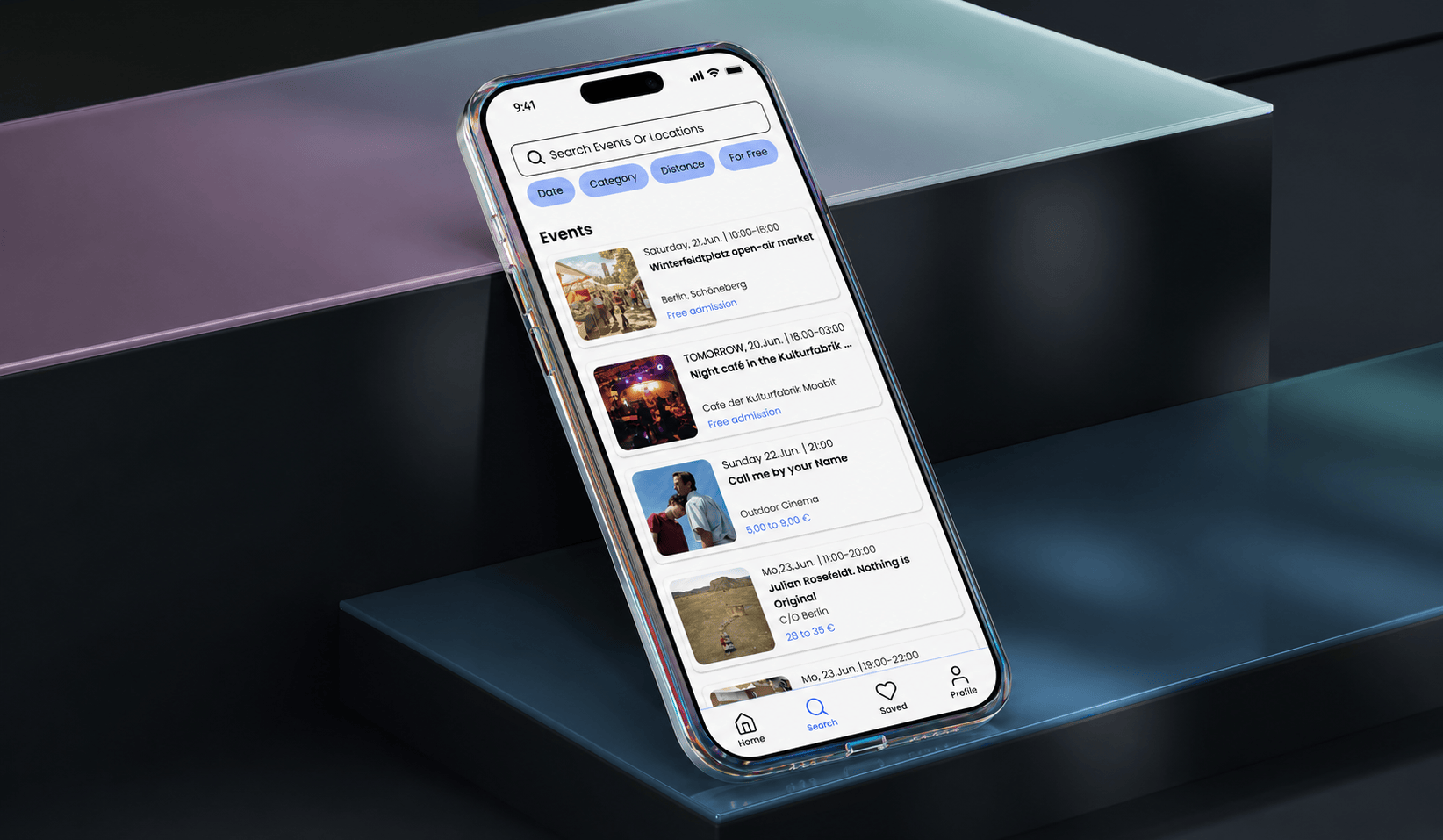
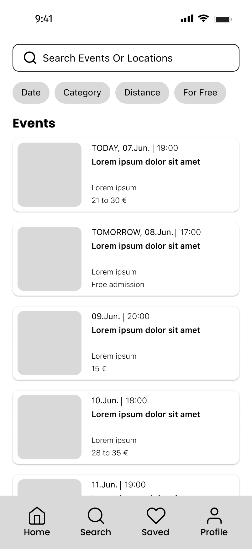
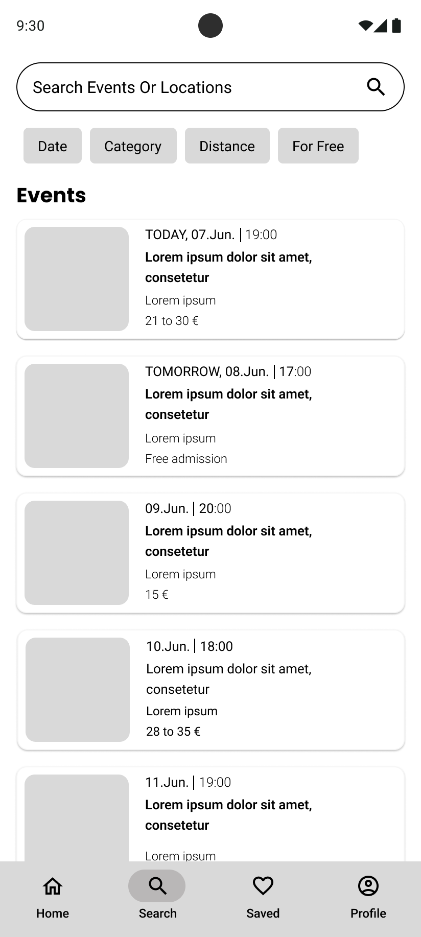
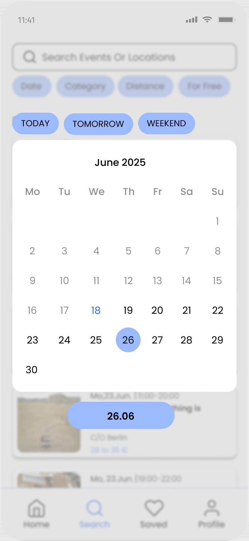
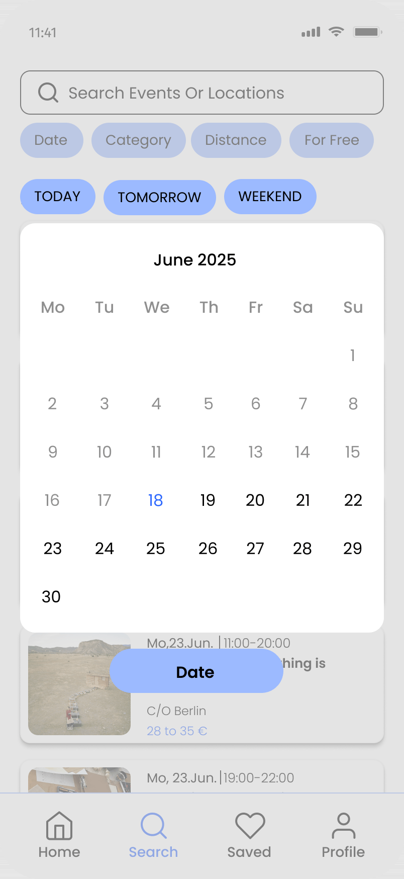
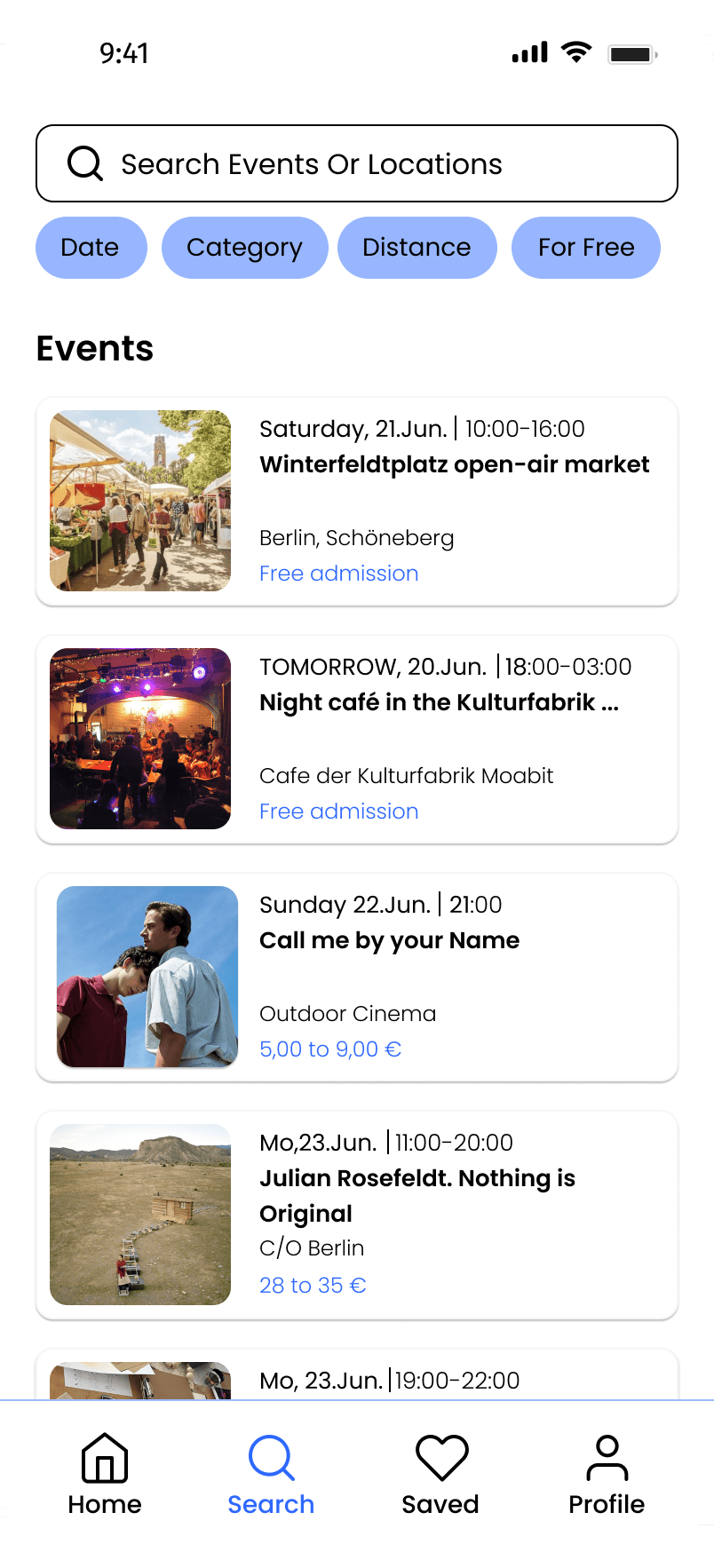
A chip row (Date / Category / Distance / For Free) sits below the search bar on both platforms. On iOS the chips take a rounded-rect treatment beneath a standard search field. On Android they follow the Material chip style, a different corner radius and a different touch-feedback behavior implied by the layout.
City selection — button order
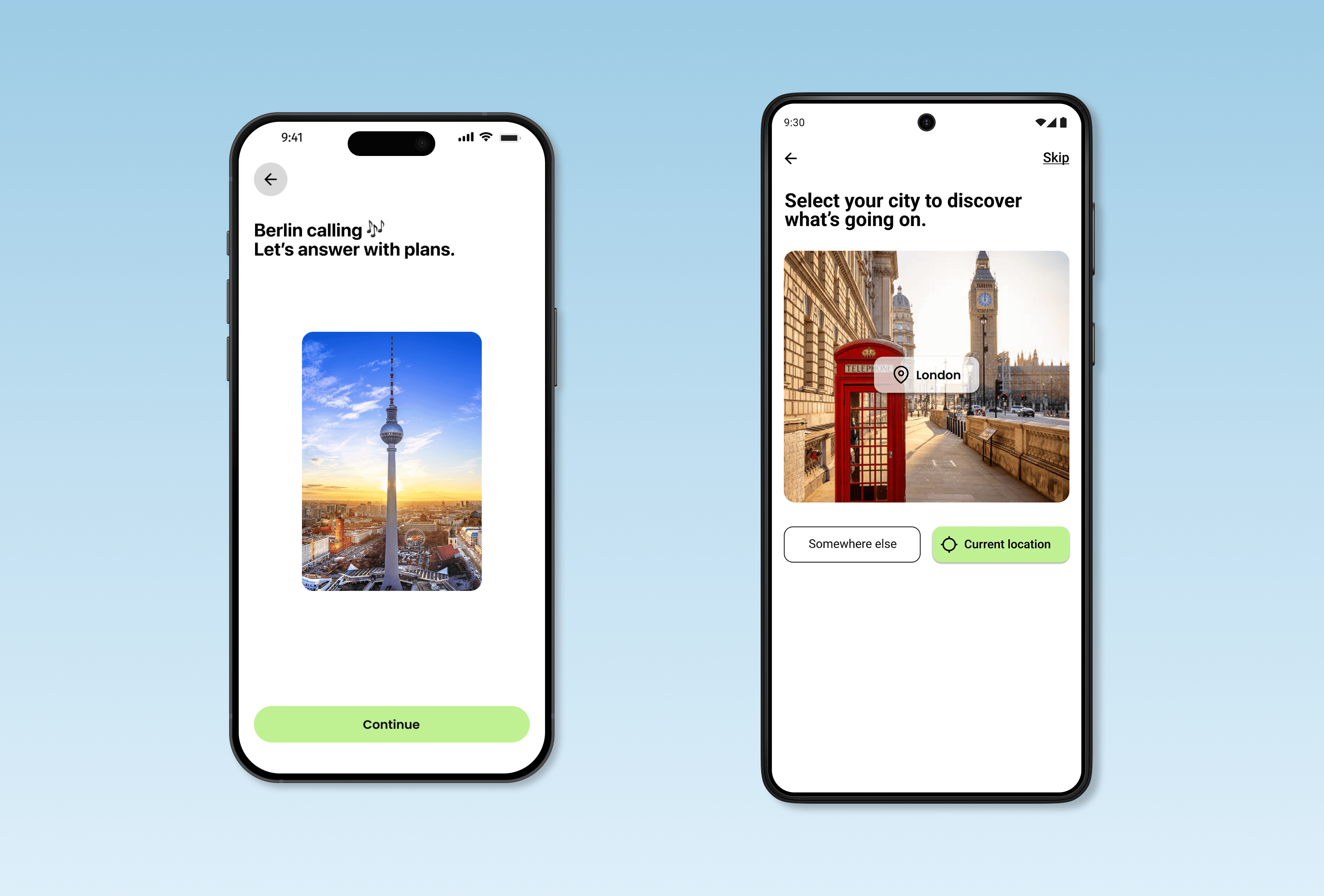
The onboarding city screen offers three options: type a city, tap a suggestion, or use your current location. Rather than changing the flow between platforms, I adapted the layout to feel native. On iOS, the actions are stacked vertically to emphasize the primary path while keeping the alternative easy to find. On Android, they’re arranged side by side to better match Material Design patterns. Small decisions, but the kind that add up to an app that feels built for your phone, not ported to it.
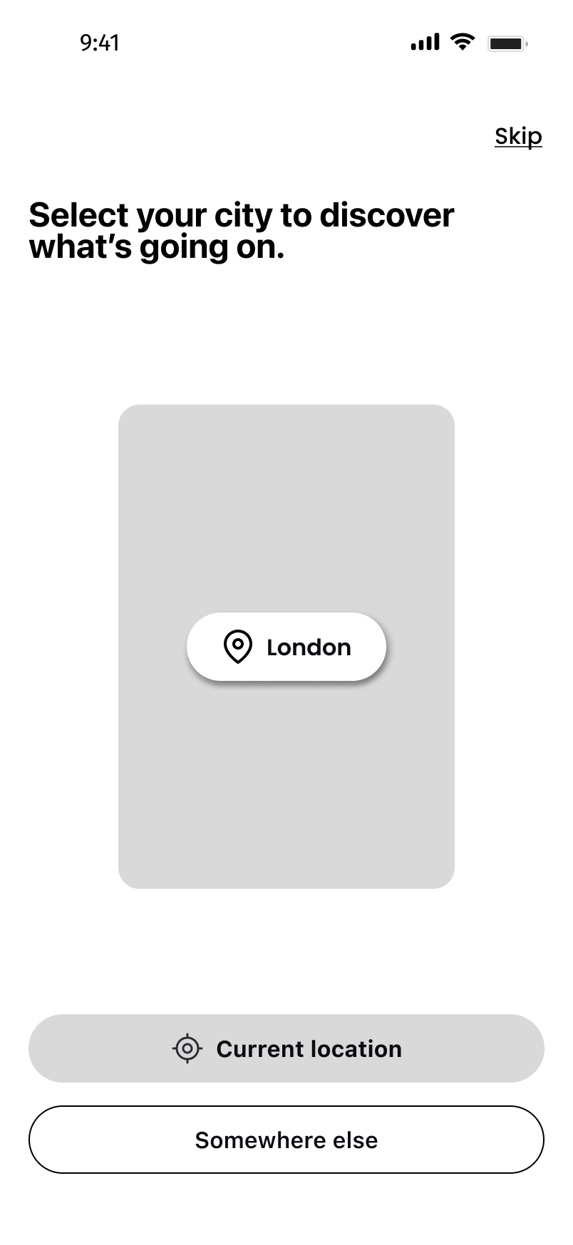
“Current location” and “Somewhere else” ordered for an explicit, user-initiated permission prompt.
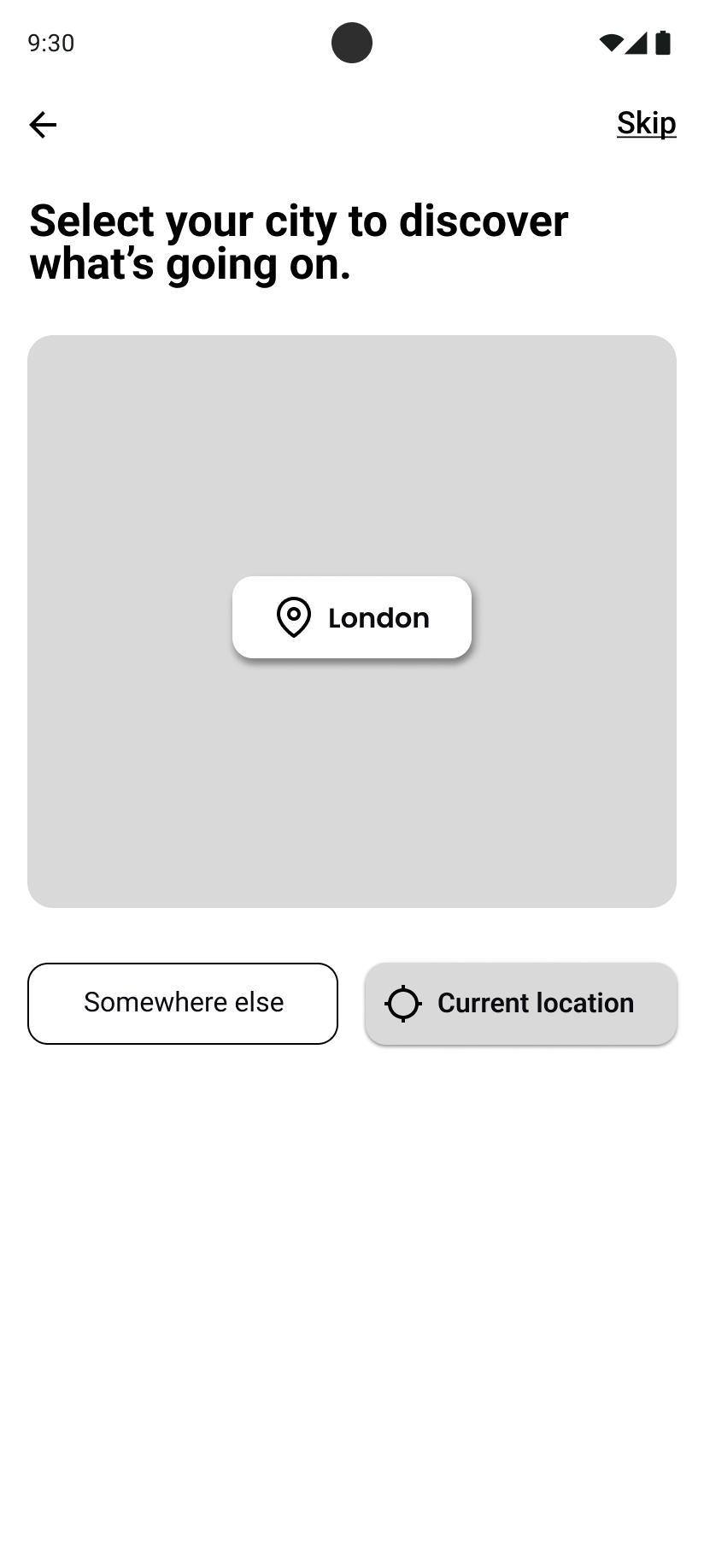
Reversed emphasis — location offered earlier, in step with Android’s OS-level flow.
Search keyboard — native input
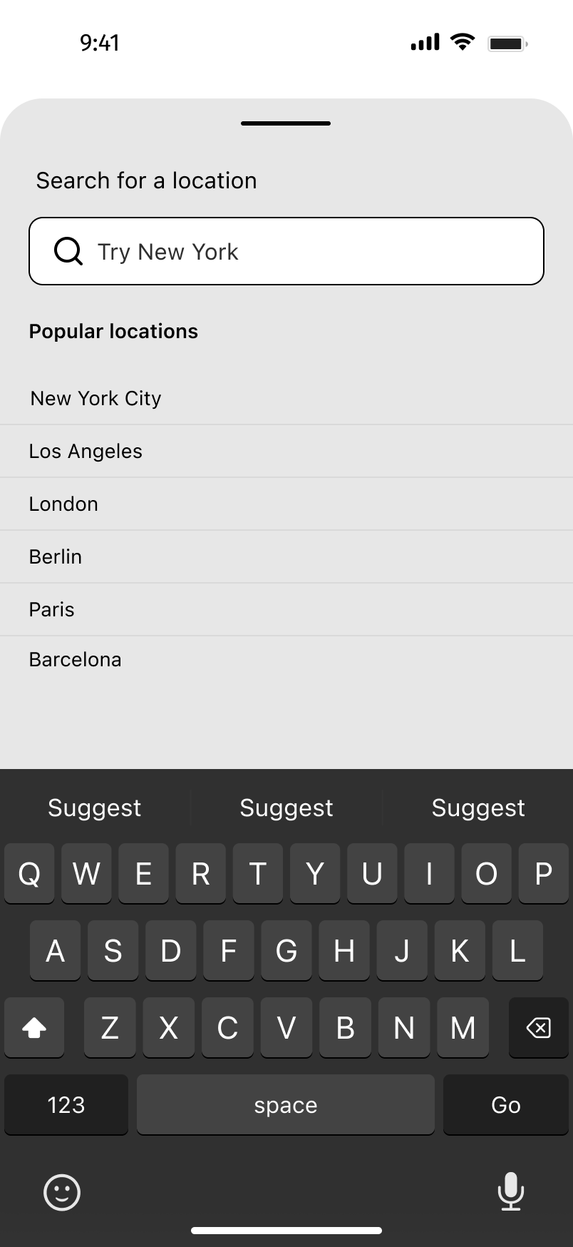
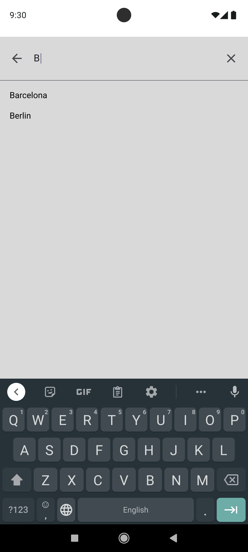
When a user taps into the location field, the keyboard that rises is the platform’s own. iOS presents the QuickType bar and an iOS layout with a “Go” key; Android presents the Material keyboard with its suggestion strip and arrow-key action. Designing with the real keyboards in place kept the layouts honest about how much screen actually remains.
And the rest follows the same logic
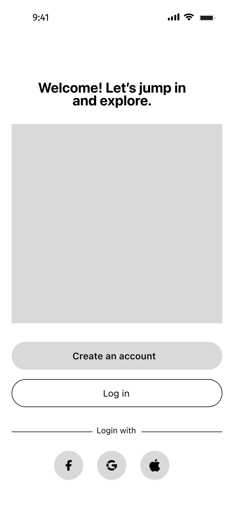
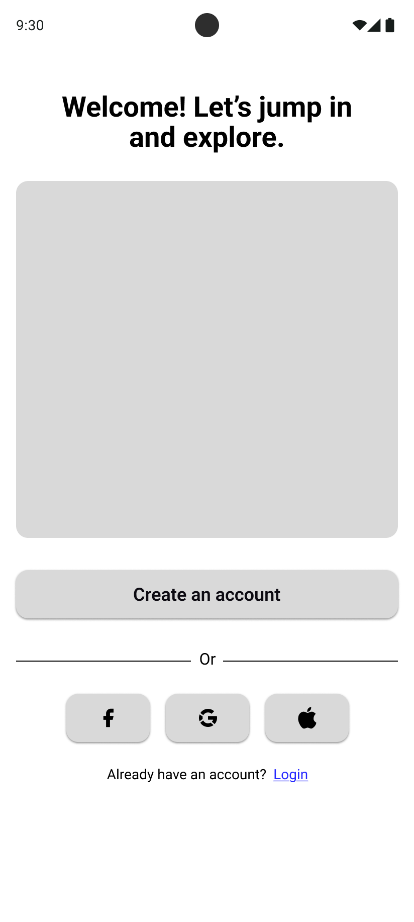
Welcome. Same content and account options; the button stack and social-login row follow each platform’s conventions.
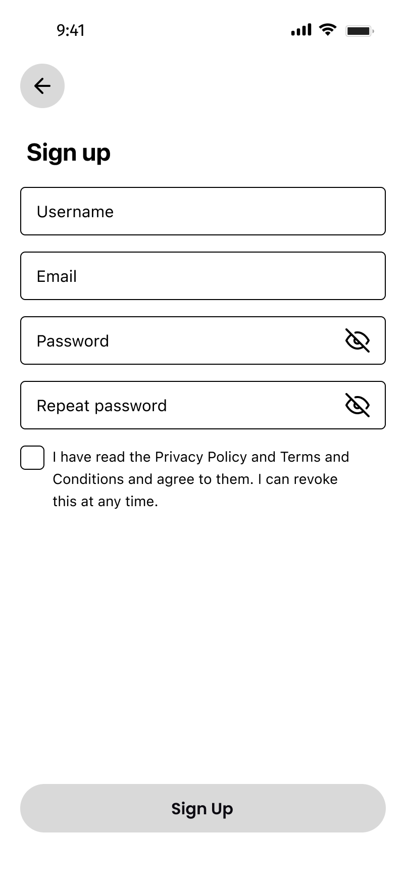
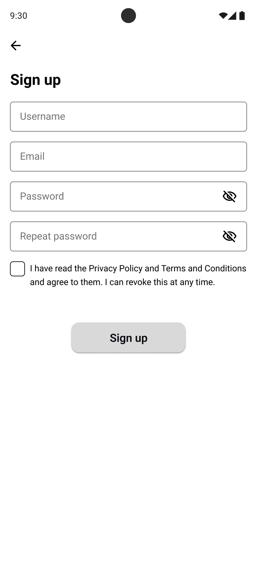
Sign up. Identical fields and validation; input styling, the checkbox, and the primary button defer to the native component set.
The complete experience
20+ Screens, End to End
The final designs cover more than twenty screens across both platforms. Rather than walk through every one, here are the moments I think matter most — shown in their iOS visual design.
Flow 1: Onboarding
Onboarding doesn’t ask for much upfront: a welcome screen, sign-up with social-login options, city selection, and then you’re in. The city screen keeps a “Skip” option, because forcing location before showing value is the fastest way to lose someone.
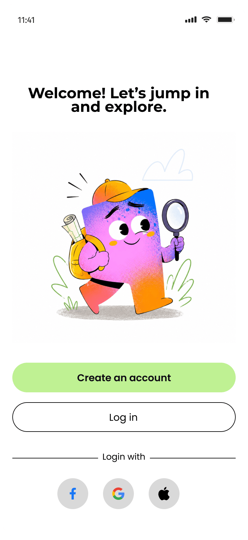
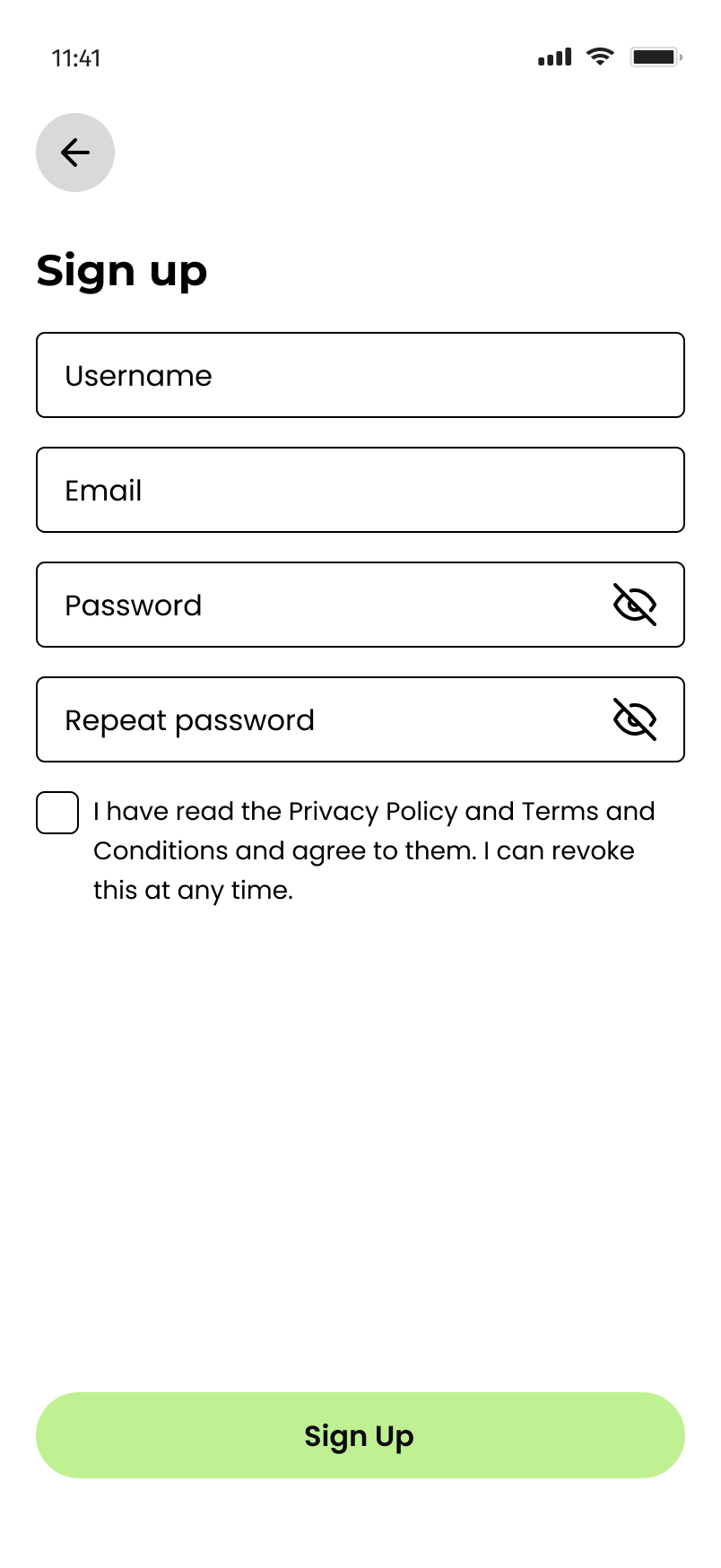
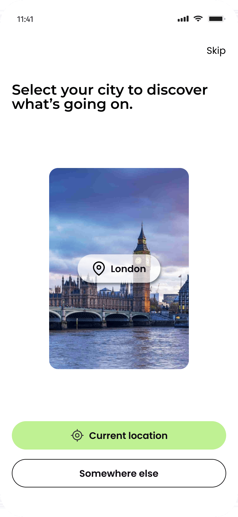
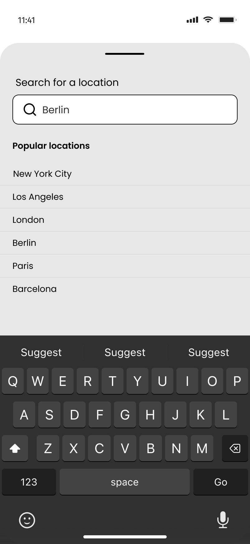
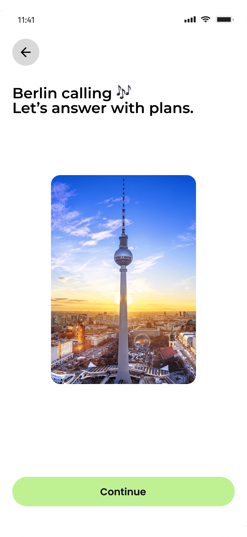
Welcome → Sign up → Select city → Search a location → Berlin calling
Flow 2: The home screen
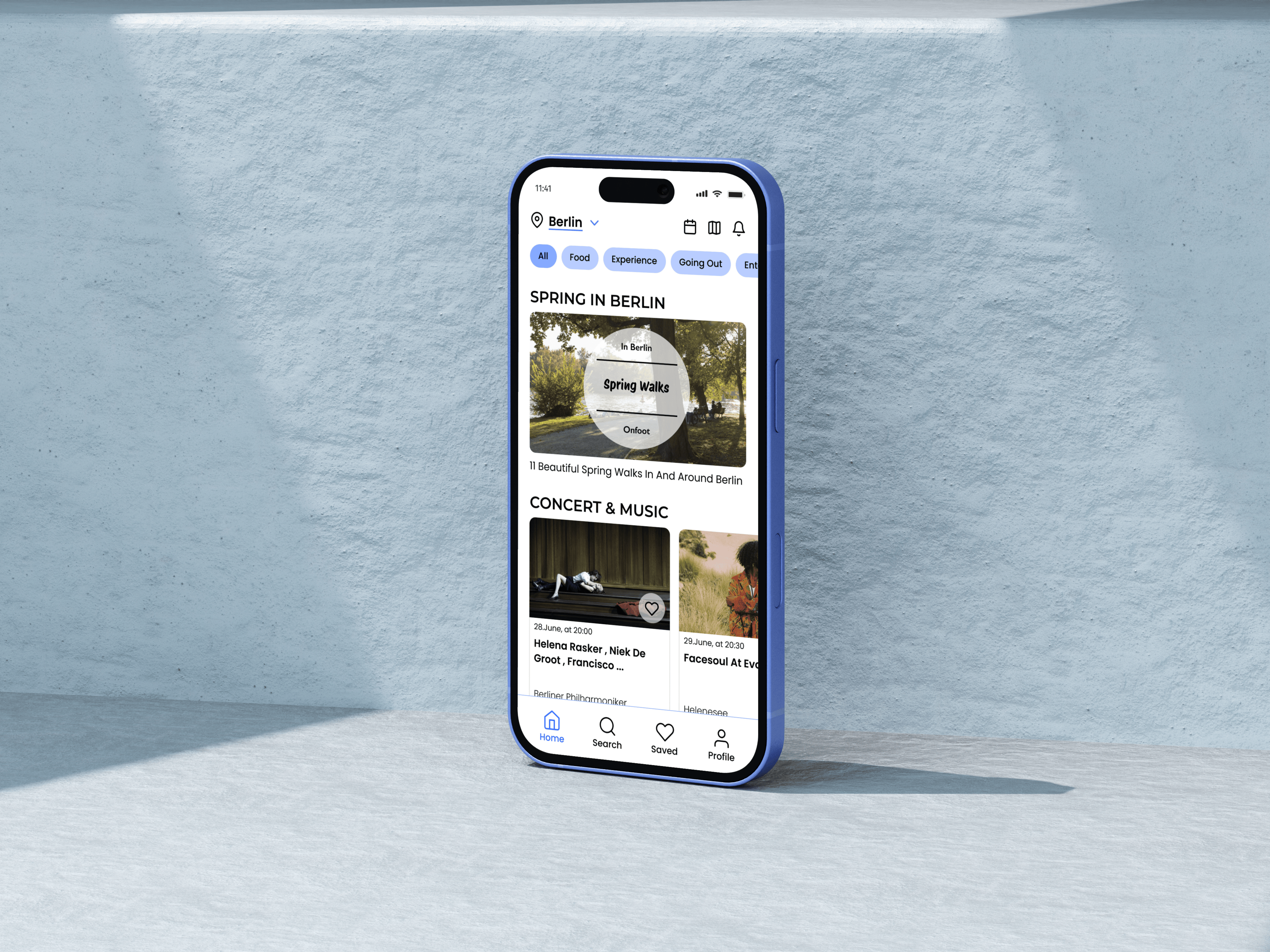
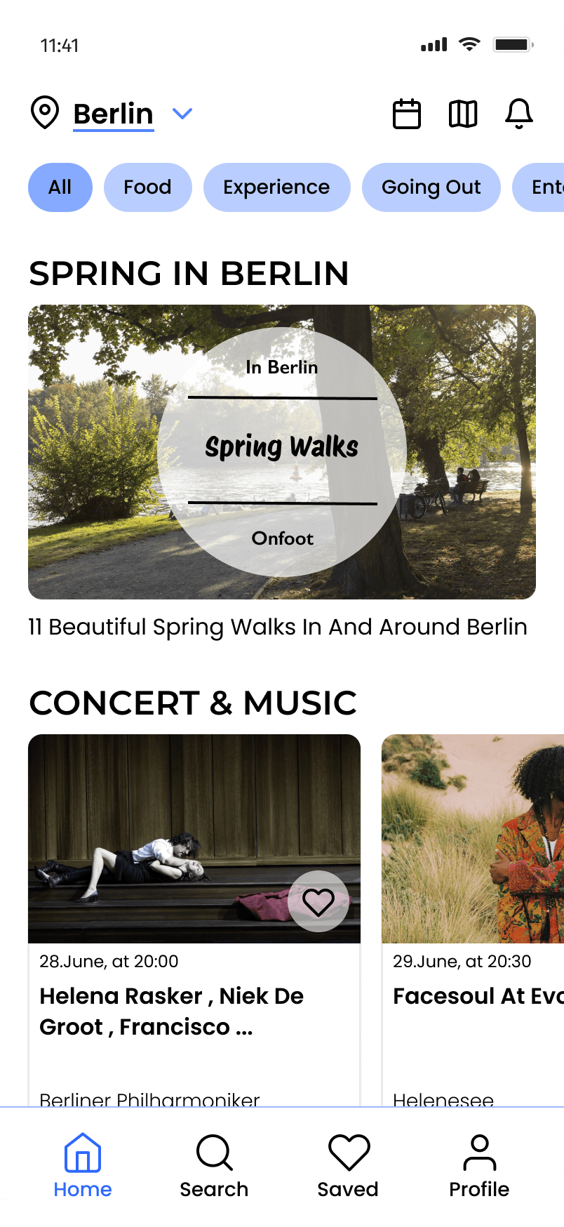
The home screen leads with editorial cards, “Spring in Berlin,” “Concert & Music”, before dropping into individual listings. The editorial cards use large photography because atmosphere sells events more than information does; the smaller cards below carry the practical details: date, venue, price, free admission.
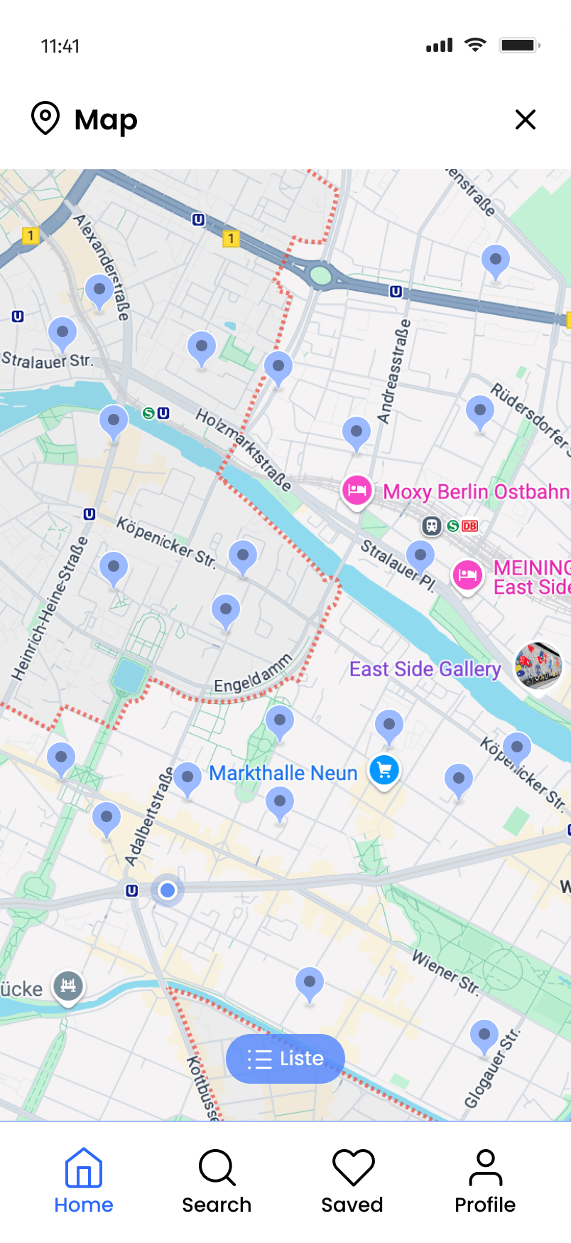
The map exists as a secondary screen rather than a primary tab. That was deliberate: Onfoot’s core value is content discovery, not spatial navigation. A user who wants the map has already decided to go out — the map serves them; it doesn’t need to serve the user who’s still deciding.
Home feed → Search & date filter → Map view
Flow 3: Event detail
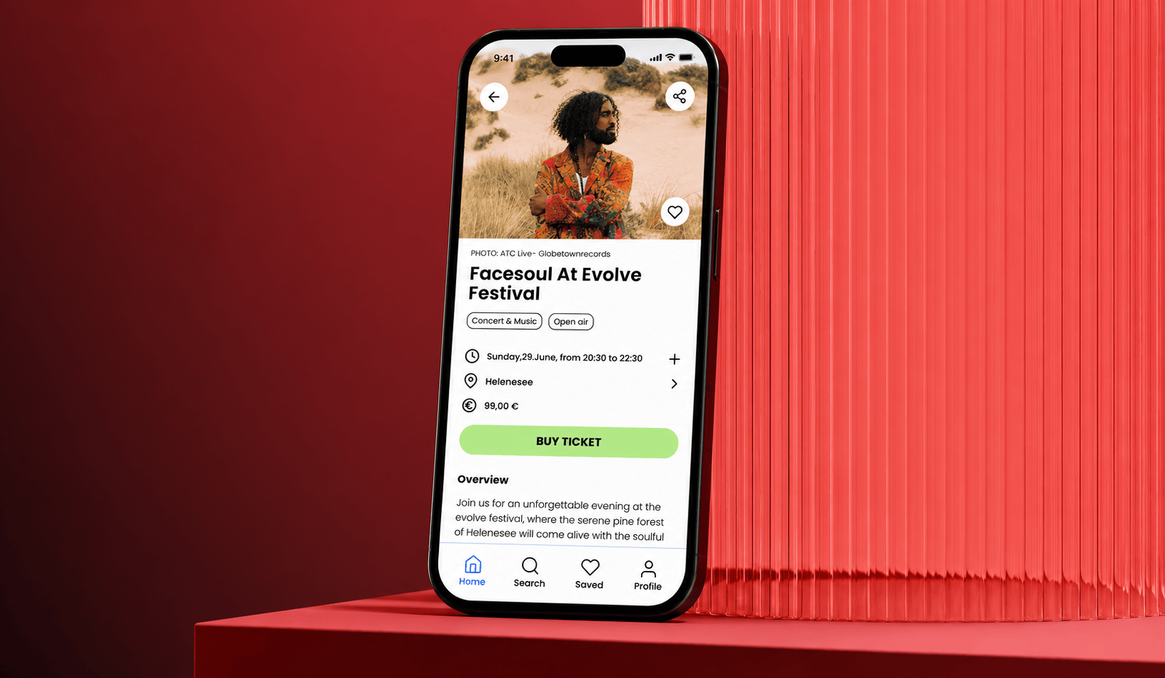
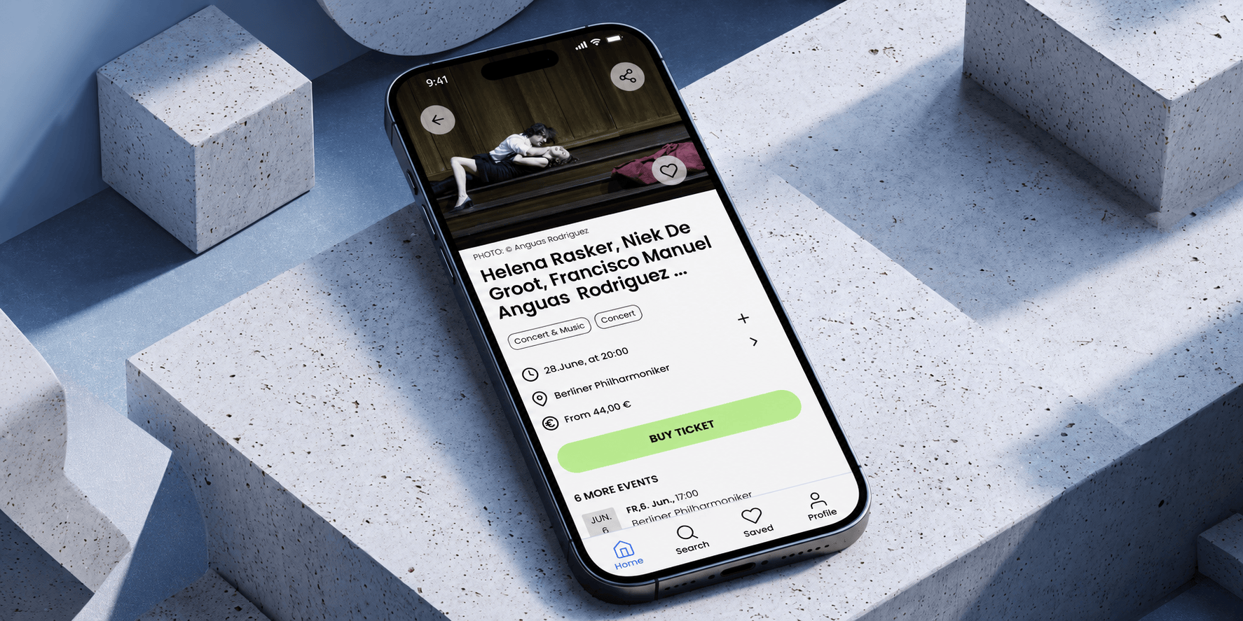
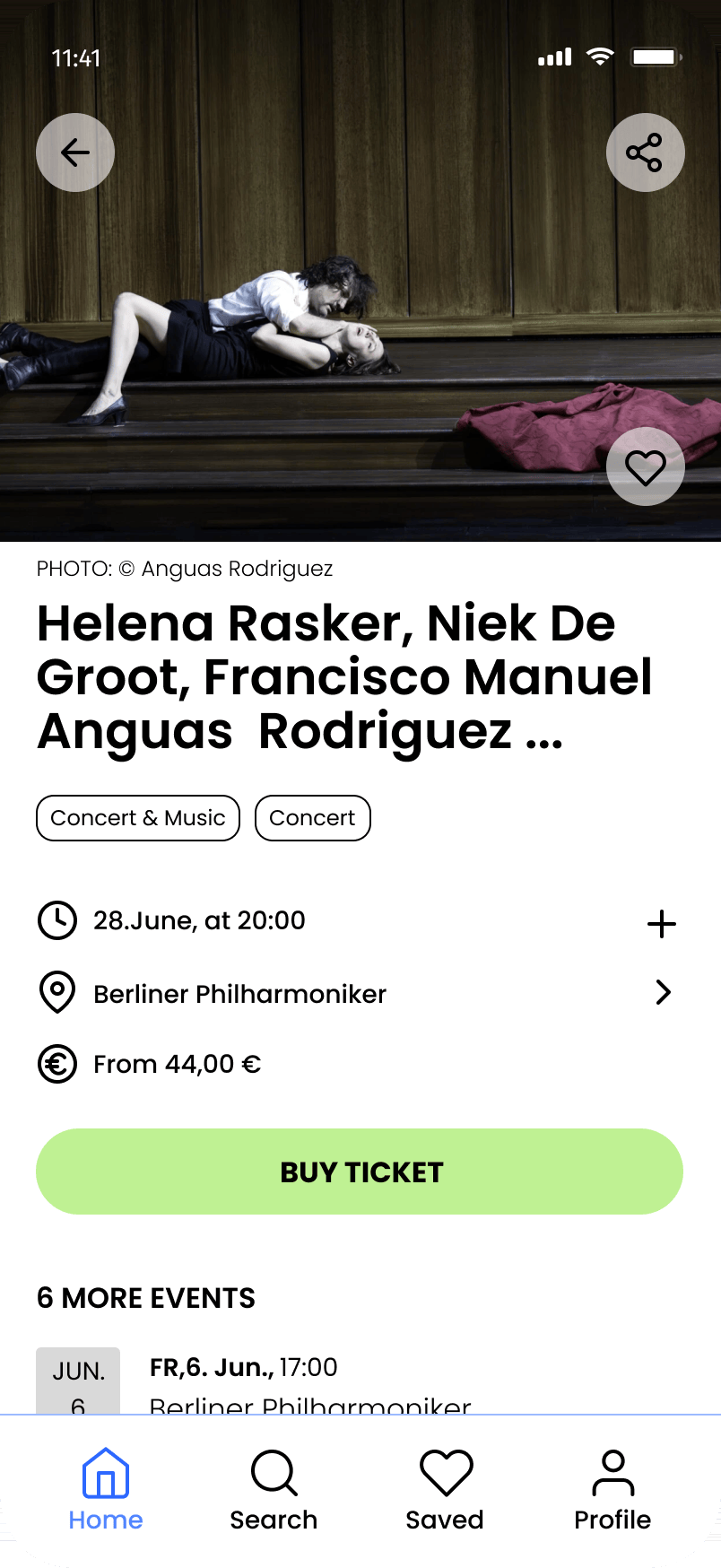
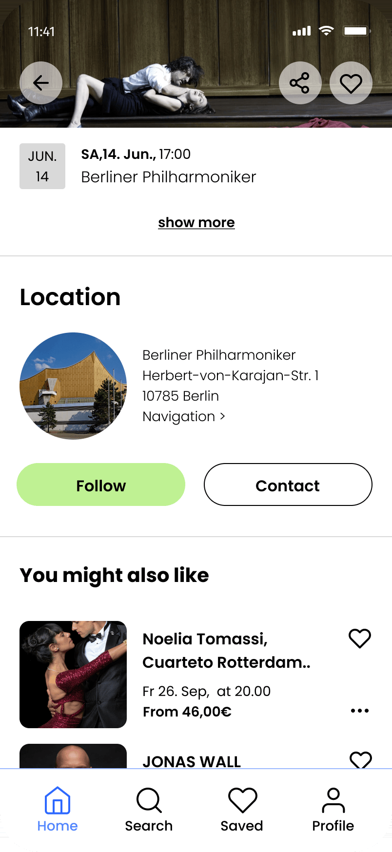
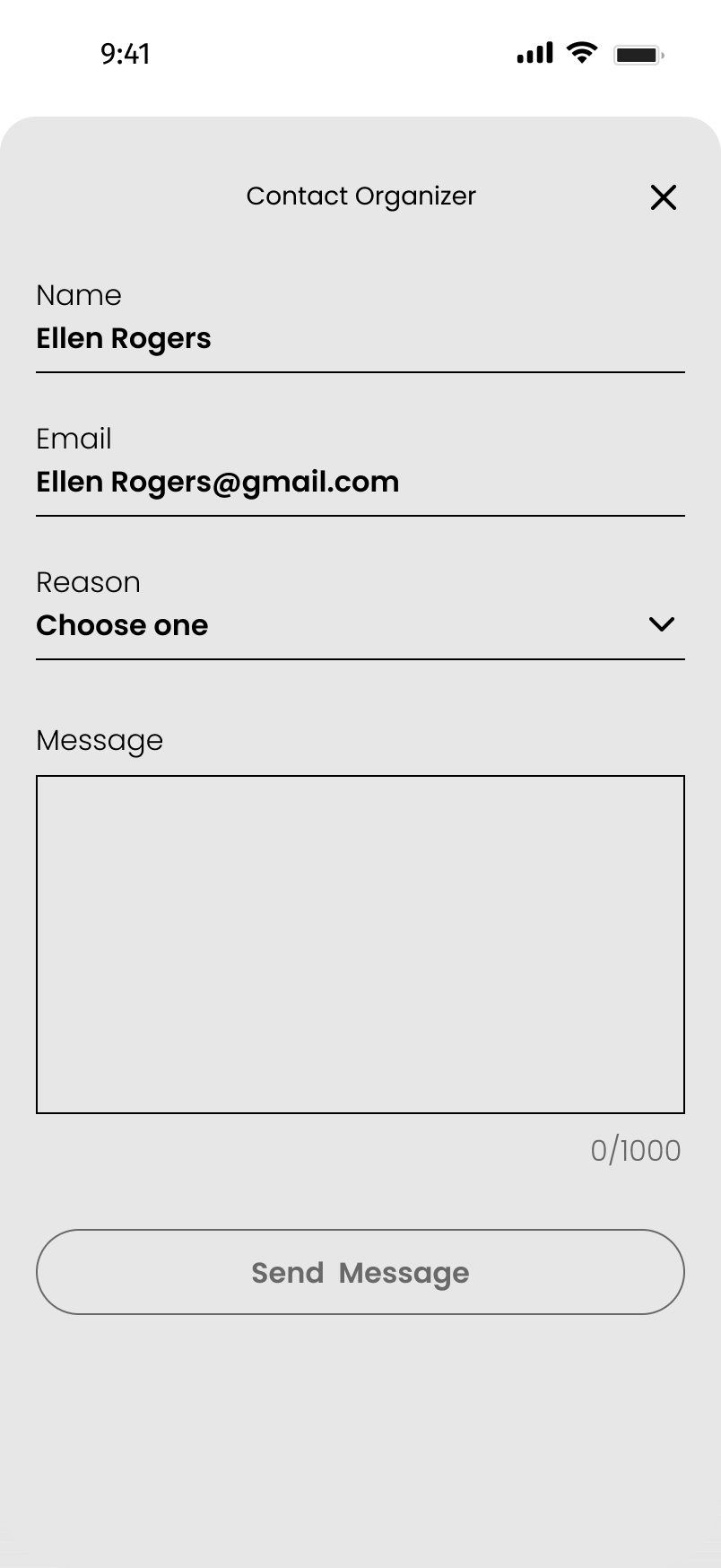
Event Detail is where the design earns its keep. It carries a lot: hero image, title, tags, date and time, venue with a navigation link, price, the primary CTA, additional dates, venue info with Follow and Contact, and a “You might also like” section. The hierarchy had to be exact, what, when, where, how much, can I go? all within the first screen height, with everything else below.
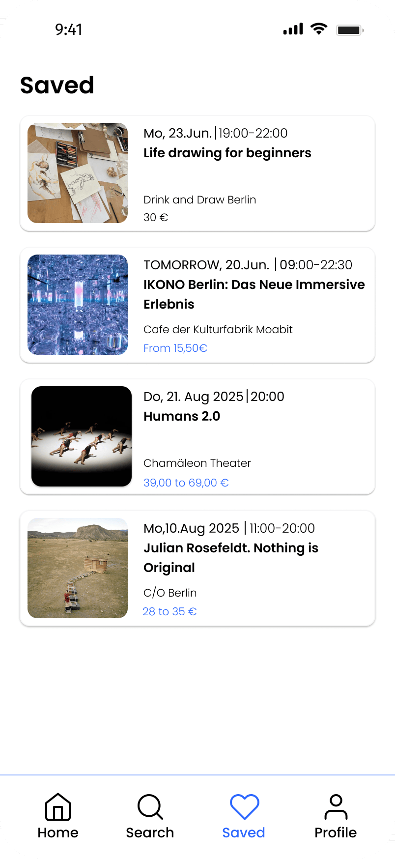
While the primary journey continues through the event details, users can access Search, Saved, and Profile at any time via the persistent bottom navigation. These screens support discovery, saved content, and account management without interrupting the main event browsing flow.
Event detail → Venue & more like this → Contact organizer
Flow 4: Checkout
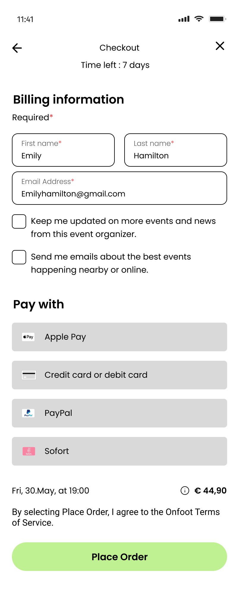
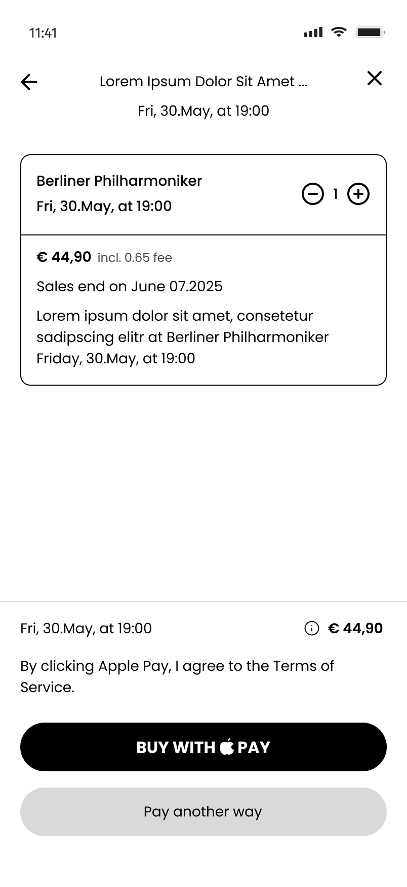
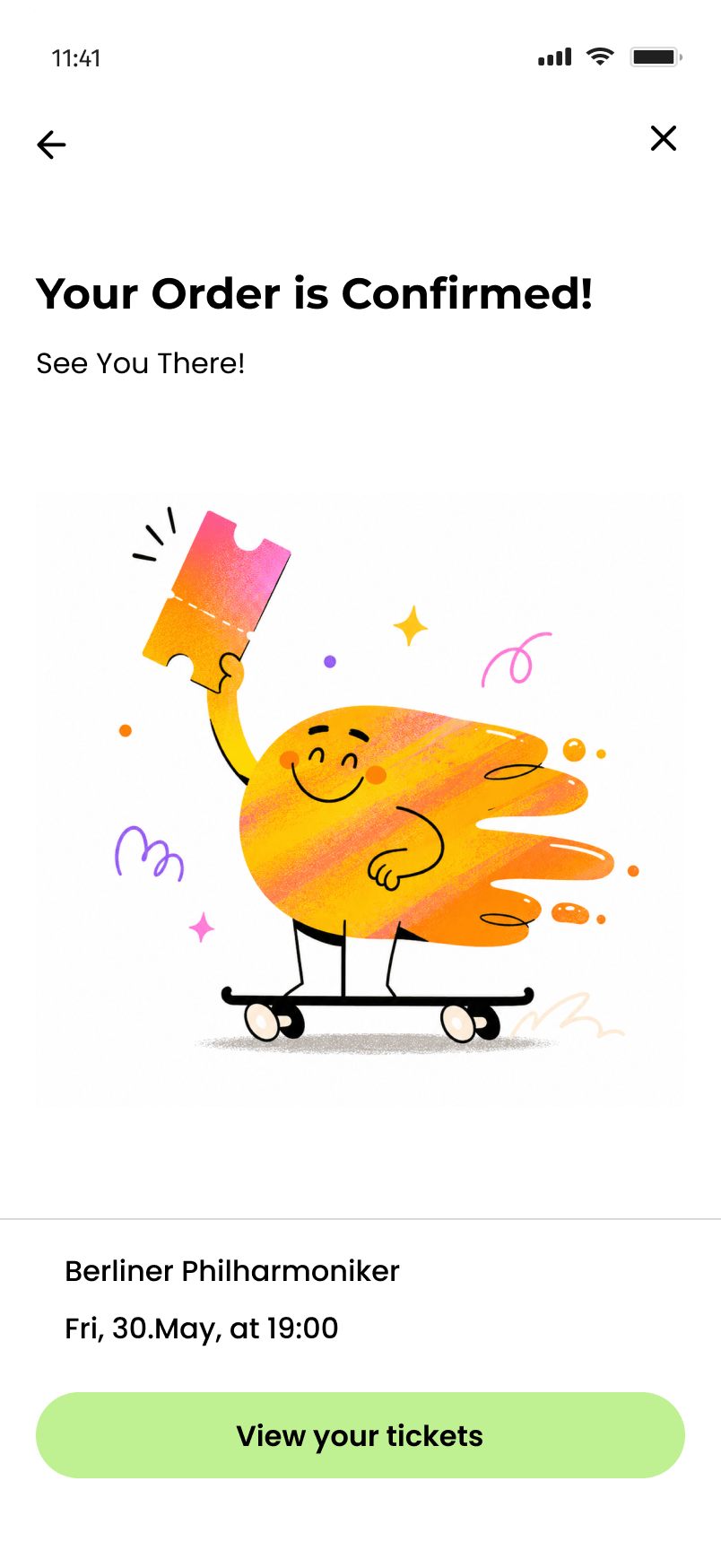
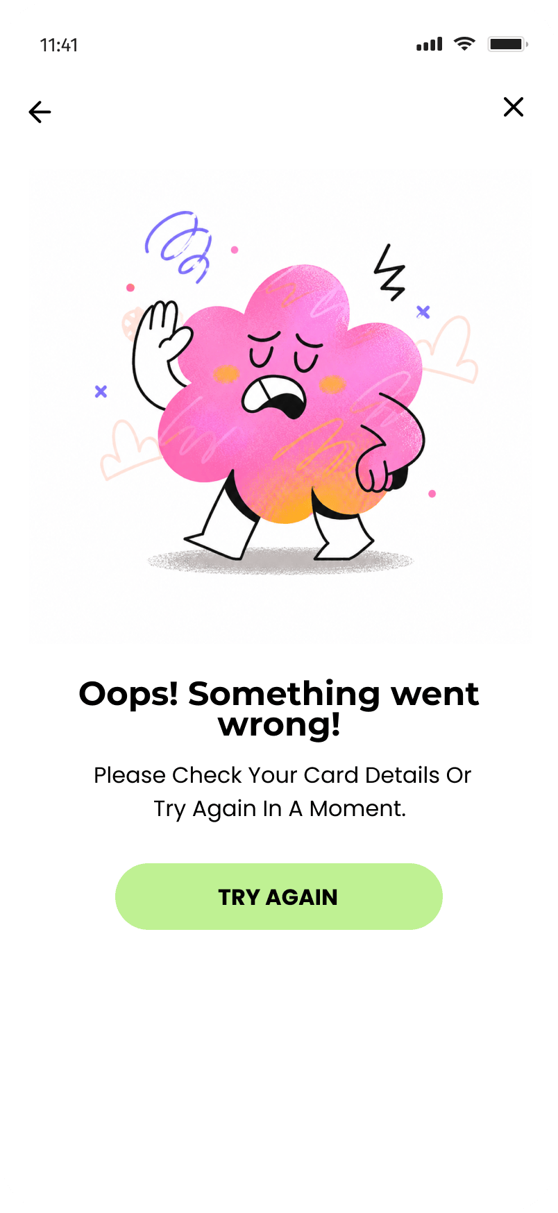
Checkout is fully designed: billing information, payment-method selection (Apple Pay prioritized on iOS, card-first on Android), order confirmation, and an error state. Designing the error state wasn’t an afterthought, it’s part of the contract the app makes with the user the moment they hand over payment details.
Billing → Pay → Confirmed · Error
What I learned
What Designing a Product Involves
Four weeks is not enough time to design a great product. It is enough time to learn what designing a product actually involves.
Platform thinking, at the level that matters
Before Onfoot I understood iOS and Android conventions at a surface level. After designing the same 20+ screens twice, making explicit decisions at every point of divergence, I understand them where it counts: not what the guidelines say, but why they say it, and what breaks when you ignore them.
Completeness is a design skill
Designing the ideal journey is easy. The real challenge is designing for what happens when things go wrong, a payment fails, a user skips onboarding, a city can’t be detected, tickets sell out. Those moments reveal whether a product feels complete. Onfoot gets many of them right; some gaps remain, and recognizing them is the first step toward designing something better.
What I’d do differently
Where I’d Push Next
Test the editorial-feed assumption
The whole home screen rests on the hypothesis that users want curated content before being asked to search. That might be right, or users might feel less in control and prefer search-first even when browsing. I’d put both versions in front of real people before committing.
Build out the map properly
The map exists, but its interaction model is underdeveloped. How do pins cluster across zoom levels? What appears in a pin’s preview card? How does a user move from the map back into event detail? Well-designed location apps have answers, I didn’t design mine rigorously enough.
Resolve the “Active Lotteries” feature
It appears on the profile as a real feature, but it’s never explained in the flow or on event detail. Either it deserves to be fully designed — entry experience, win notification, or it should be cut. A feature that lives on one screen creates more questions than it answers.